

Design comparison

Solution retrospective
I felt good this time to use global values, since the design has many sections with similar styles I think it was beneficial not to repeat code.
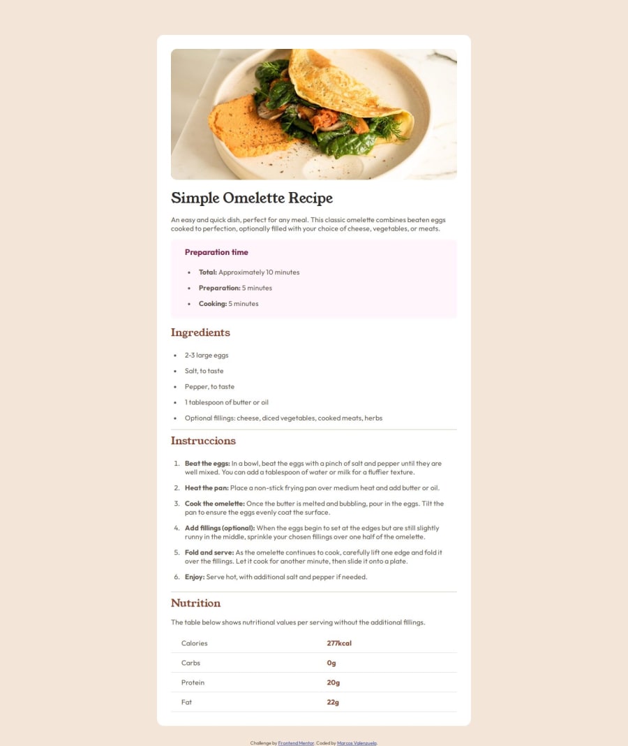
What challenges did you encounter, and how did you overcome them?I think there must be a better solution to overflow the image of its parent container in its mobile version, I used a media querie with different styles, but I feel it's a bit forced.
What specific areas of your project would you like help with?On this occasion I would like information on how to handle the images, inside your container I have good notions of how it works, but it was complicated to overflow the image in different resolutions.
Community feedback
- P@coding-brianPosted 6 months ago
The hr top and bottom margin isn't the same with desgin, neither is li marker's color.
0

Please log in to post a comment
Log in with GitHubJoin our Discord community
Join thousands of Frontend Mentor community members taking the challenges, sharing resources, helping each other, and chatting about all things front-end!
Join our Discord