Design comparison
Solution retrospective
I focused on writing good semantic HTML in this project, which helped me understand which HTML elements to use for specific purposes and which ones to avoid. I also improved on accessibility by using em units.
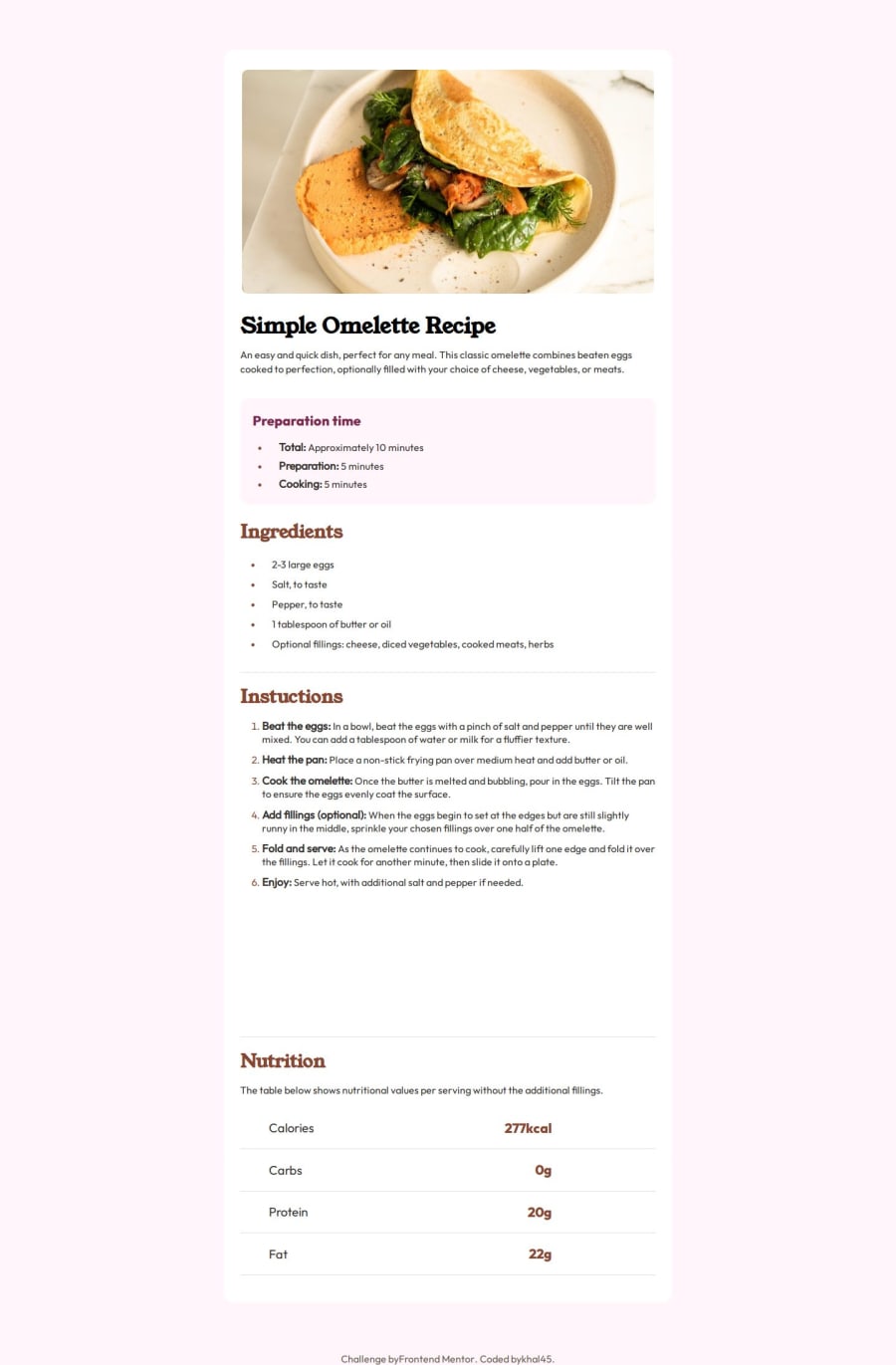
What challenges did you encounter, and how did you overcome them?I could not quite get the quantity of the nutritional values to be vertically alligned, and start at the same point as it is in the design. I did a lot of google search and tried looking for websites with similar design to inspect but could not quite find any.
What specific areas of your project would you like help with?I need help in vertically aligning the quantity of the nutritional values to look exactly like the design.
Community feedback
- @beowulf1958Posted about 1 month ago
Great job completing this challenge. Overall, it looks pretty good. You were able to color the list markers, which a lot of people miss.
You do have a problem in your mobile design: the last step in the instructions bleeds out of the container, and the Nutrition title overlays it and it is impossible to read. This can be fixed by removing the
height: 77vh;style from the .instructions-wrapperAs to the quantity lining up, have you tried making the .nutrition-div display grid instead of flexbox? You get better control of the grid elements than you do with flexbox items. I got pretty close to the design by adding to the nutrition-div
  display: grid;
  grid-template-columns: 1fr 1fr;
Hope this helps.
Marked as helpful0
Please log in to post a comment
Log in with GitHubJoin our Discord community
Join thousands of Frontend Mentor community members taking the challenges, sharing resources, helping each other, and chatting about all things front-end!
Join our Discord
