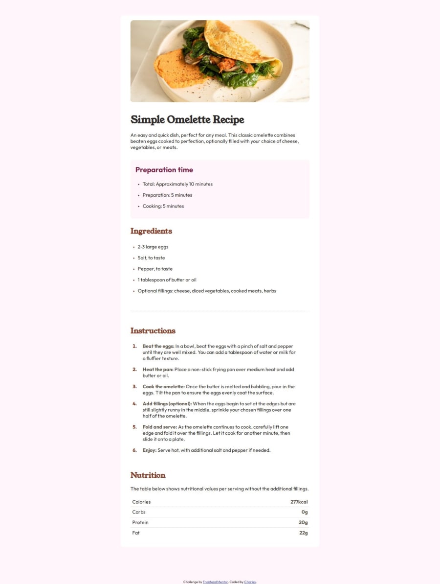


Design comparison
SolutionDesign

Solution retrospective
What are you most proud of, and what would you do differently next time?
I practiced a bit more on responsive layouts and I got to finally understand how to use the :nth-child and :nth-last-child Just discovered I don't properly use Semantic HTML elements so in my next project that's what I'll do differently
I got frustrated trying to change the color of the numbers in an ordered list but I managed to google out a few tricks
What specific areas of your project would you like help with?Making responsive layouts
Community feedback
Please log in to post a comment
Log in with GitHub
Join our Discord community
Join thousands of Frontend Mentor community members taking the challenges, sharing resources, helping each other, and chatting about all things front-end!
Join our Discord