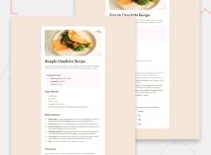
Responsive recipe page with tailwind css
Design comparison
Solution retrospective
I feel that things are getting easier as I work with tailwind.
What challenges did you encounter, and how did you overcome them?Community feedback
- @mirkobozzettoPosted 7 months ago
first of all, well done, your code looks very similar to the model, dana lamaquette the words "total, preparation & cooking" are in bold mode but in bold black, whereas they are the same colour as the rest of the line. I also noticed that the radio border of the card is normally more accentuated than yours
you've also used a darker colour in the instructions with the numbered list instead of the basic colour, which was the same in different places
and finally there was also the image of the omelette which had a bit more border radius, but that's really to share a few details about the visual aspect
as for the code, I didn't have access to your github and got a 404 error, so I'd have been interested to see your code.
Well done to you in any case
0
Please log in to post a comment
Log in with GitHubJoin our Discord community
Join thousands of Frontend Mentor community members taking the challenges, sharing resources, helping each other, and chatting about all things front-end!
Join our Discord
