Responsive recipe page with media queries and many colours


Design comparison

Solution retrospective
Owww that was a headache! Next time I would use a text_wrapper div
What challenges did you encounter, and how did you overcome them?Styling the bullet points. I learned how to use li::marker to style these and also list-style-position: outside; to keep the list item text aligned with itself rather than the list marker.
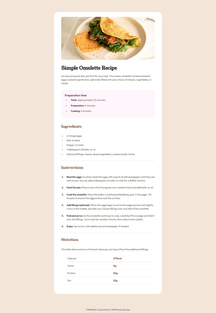
When I wanted to make the page responsive I realised that I should have checked the mobile and desktop designs more thoroughly as the padding around the image that was contained in the card div created a problem. I then had to go back and add another wrapper div around the text so that I could remove the padding from the card and have some padding on the text. It was a PAIN.
What specific areas of your project would you like help with?One of the main issues I struggled with was identifying the colours as the changes between these were to subtle. Any pointers on this for consistency moving forward, or anything else you notice I am happy to receive feedback on. :)
Community feedback
- P@joeleg96Posted 19 days ago
It looks like your live page isn't actually working, so I wasn't able to take a look at your work to see how it looks/responds to page sizes. I took a quick look at your code though and I like that you used variables to define your font sizes and the various font colors. This makes it a lot easier to make those changes rather than assign them individually. I noticed you switch a lot between viewport w/h, rem, and pixels throughout your code. I would try and stick to one so that it's easier for your to make the necessary changes, rather than cycling through various measuring standards. It would be like an engineer switching between yards, meters, feet, and kilometers without any clear reason. Overall keep up the good work and good luck on your coding journey!
Marked as helpful0@Joan-Bell-FayePosted 19 days ago@joeleg96 thanks for your feedback. Yeah I broke it after I decided to alter the <h3>Preparation and make this a <p>. Still getting to grips with github so deleted and replaced the html and css files then realised I couldn't resubmit this to Frontend Mentor! Oops! You're right about the units, I like px for borders so doubt I'll change that but I agree, with choosing and sticking to vh, %, or rem in other areas. What do you prefer for sizing a responsive element and why? Thanks again for your feedback :)
0


Please log in to post a comment
Log in with GitHub
Join our Discord community
Join thousands of Frontend Mentor community members taking the challenges, sharing resources, helping each other, and chatting about all things front-end!
Join our Discord