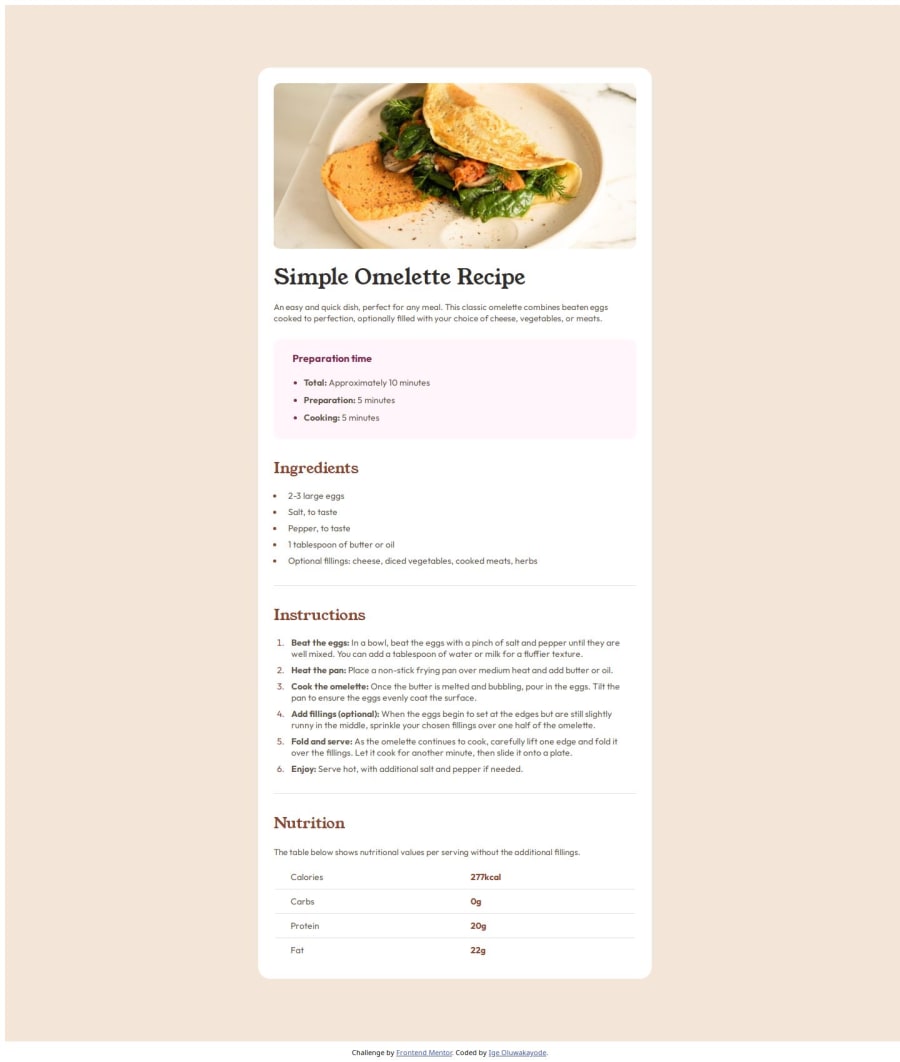
Design comparison
Solution retrospective
What I'm most proud of is the fact that I was able to debug my code effectively and learning numerous semantic HTML along the way, I'm excited to see what I would do differently myself next time.
What challenges did you encounter, and how did you overcome them?It was a bit challenging as I was trying to make use of semantic HTML, so trying to get the [] to style properly (across all screen sizes) was one of my challenges in this project coupled with the [::marker] icon in [li] of [ol] - apparently they weren't adjusting to the [list-style-type].
I solved the first one by understanding that there's a [thead] [tbody] and [tfoot] tags in between the table tag and the [tr] tag which was producing a bug as i used the CSS property: grid-template-column. The second I solved my applying the CSS property: list-style-type: decimal, on [ol] directly rather than on [li::marker].
PS: ChatGPT kept on insisting I used the later until I tried using my discretion.
What specific areas of your project would you like help with?I'd like like help with understanding better ways with adjusting the webpages to different screen sizes.
Community feedback
Please log in to post a comment
Log in with GitHubJoin our Discord community
Join thousands of Frontend Mentor community members taking the challenges, sharing resources, helping each other, and chatting about all things front-end!
Join our Discord
