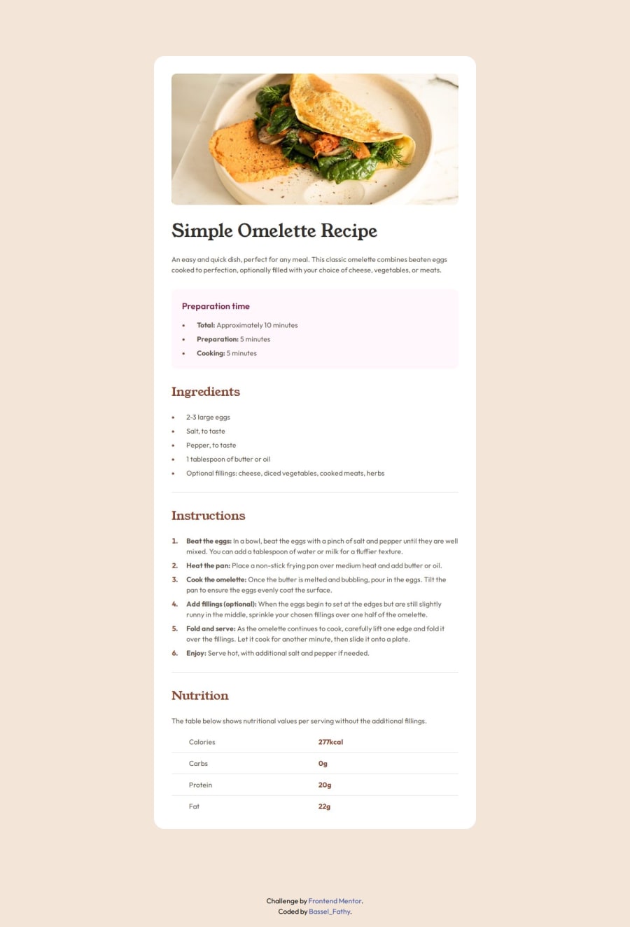
Design comparison
SolutionDesign
Solution retrospective
What are you most proud of, and what would you do differently next time?
Proud of being able to use media queries to make the design responsive, and maybe next time I will use a framework like tailwind to handle this situation.
Faced some challenges moving ::marker pseudo element inside the parent element and changing it's padding.
- solved it by adjusting
listart-margin and padding instead of usinglist-style-position: inside;.
I don't feel there is something I need help with so far.
Community feedback
Please log in to post a comment
Log in with GitHubJoin our Discord community
Join thousands of Frontend Mentor community members taking the challenges, sharing resources, helping each other, and chatting about all things front-end!
Join our Discord
