Design comparison
Solution retrospective
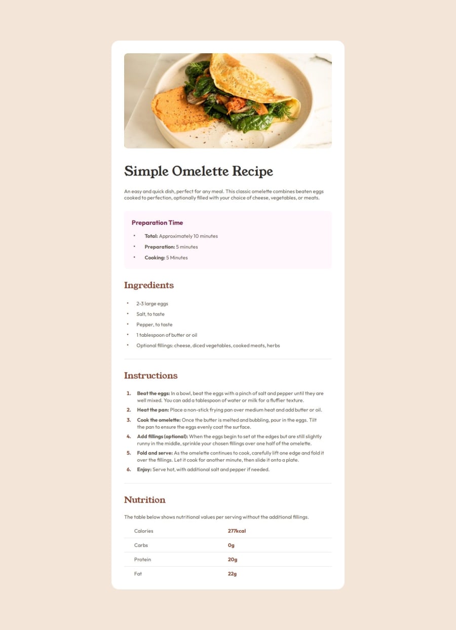
I'm proud of how I used the design files to replicate the design as close as possible, as well as using semantic HTML.
I also used different media queries to handle the different styles on a range of screen sizes.
What challenges did you encounter, and how did you overcome them?I found getting the spacing of text in certain areas correct, but I used to figma files to get past this and come as close to the original design as possible
What specific areas of your project would you like help with?Is there a way to make the design responsive without having to use multiple media queries.
Join our Discord community
Join thousands of Frontend Mentor community members taking the challenges, sharing resources, helping each other, and chatting about all things front-end!
Join our Discord
