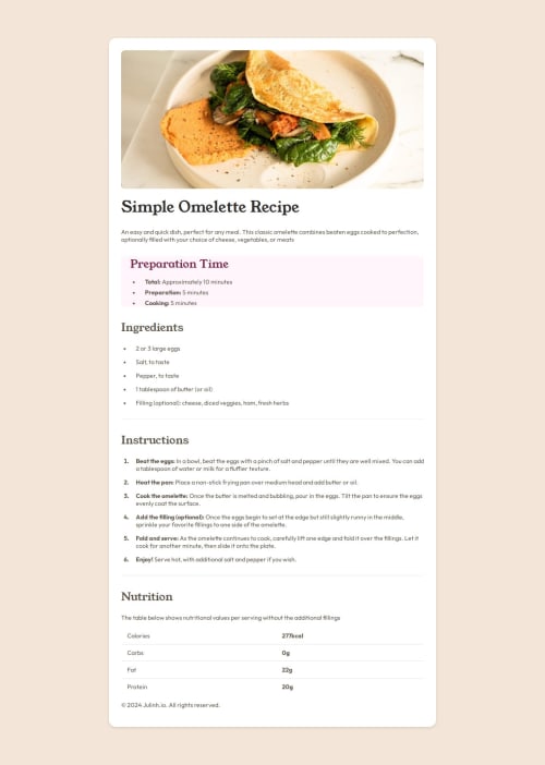
Responsive Recipe Page with GitHub Deployment, GitHub Pages

Solution retrospective
Although this project was a relatively basic task, I’m proud of it because it marks my first front-end project by myself. One of my happy-moment was successfully figuring out how to implement media queries, which allowed me to make the recipe page responsive across different screen sizes. I also navigated the complexities of using Git and GitHub for version control, managing everything from initializing the repository with Git Bash to deploying the project live on GitHub Pages. The experience of managing the entire process—from coding to deployment—was both challenging and rewarding, and it gave me a solid foundation in project management.
If I were to do this project again, I would focus on refining the CSS, perhaps by exploring more advanced layout techniques like Grid or experimenting with CSS custom properties for better scalability. Additionally, I’d like to explore using Git branching to manage different features separately before merging them into the main project, which would give me more flexibility and control over the development process.
What specific areas of your project would you like help with?I’d love to get more help with the CSS part. Specifically, I’m interested in learning and applying more advanced CSS techniques to improve the layout and design.
Please log in to post a comment
Log in with GitHubCommunity feedback
No feedback yet. Be the first to give feedback on Julinh.io's solution.
Join our Discord community
Join thousands of Frontend Mentor community members taking the challenges, sharing resources, helping each other, and chatting about all things front-end!
Join our Discord