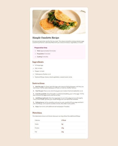
Submitted about 1 year agoA solution to the Recipe page challenge
Responsive Recipe Page with CSS Grid
@vladzen13

Solution retrospective
What are you most proud of, and what would you do differently next time?
Clean html, CSS Grid gaps, pretty simple media query
What challenges did you encounter, and how did you overcome them?list-style for ol with ::marker was quite tricky. Workaround with tag which is always first worked - it is not really clean, but works fine.
Code
Loading...
Please log in to post a comment
Log in with GitHubCommunity feedback
No feedback yet. Be the first to give feedback on Vladislav Zenin's solution.
Join our Discord community
Join thousands of Frontend Mentor community members taking the challenges, sharing resources, helping each other, and chatting about all things front-end!
Join our Discord