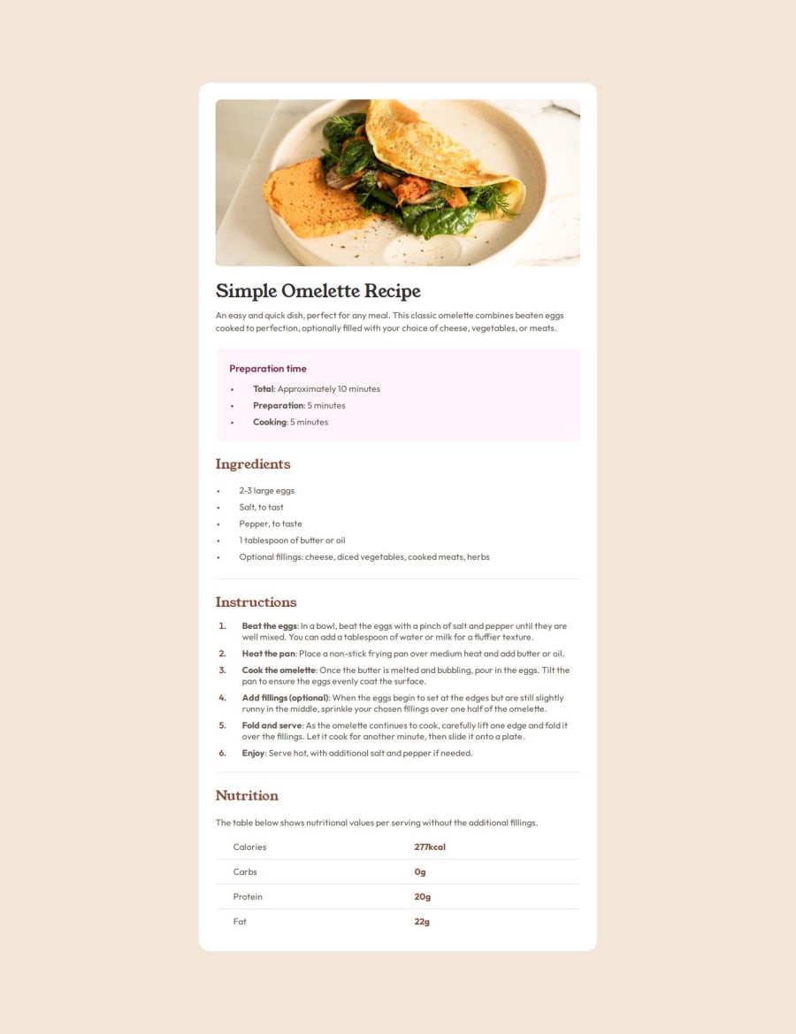
Design comparison
Solution retrospective
.
What challenges did you encounter, and how did you overcome them?.
What specific areas of your project would you like help with?.
Community feedback
- P@danielmrz-devPosted 11 months ago
Hello, @AdrienB23!
Your project is looking fantastic!
I'd like to suggest a way to make it even better:
- Using
marginisn't always the most effective method for centering an element.
Here's a highly efficient approach to position an element at the center of the page both vertically and horizontally:
📌 Apply this CSS to the body (avoid using
positionormarginsin order to work correctly):body { min-height: 100vh; display: flex; justify-content: center; align-items: center; }In this case, you still might need vertical margins due to the length of the card, but this code above is the best way to center elements anyway.
I hope you find this helpful!
Keep up the excellent work!
Marked as helpful1 - Using
Please log in to post a comment
Log in with GitHubJoin our Discord community
Join thousands of Frontend Mentor community members taking the challenges, sharing resources, helping each other, and chatting about all things front-end!
Join our Discord
