Design comparison
SolutionDesign
Solution retrospective
What are you most proud of, and what would you do differently next time?
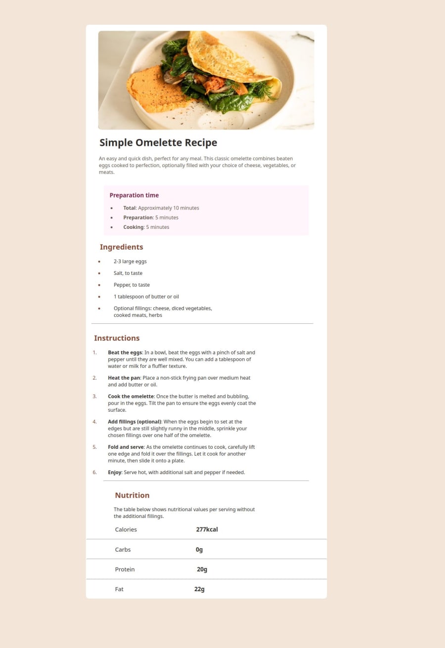
In my opinion, I managed to make it quite a close match to the original design even though I only used the pictures and didn't even open the figma file (as a challenge to myself).
What challenges did you encounter, and how did you overcome them?Figuring out how big to make the card element on the desktop version involved more guesswork than anything else but I somehow made it work.
What specific areas of your project would you like help with?N/A
Community feedback
Please log in to post a comment
Log in with GitHubJoin our Discord community
Join thousands of Frontend Mentor community members taking the challenges, sharing resources, helping each other, and chatting about all things front-end!
Join our Discord
