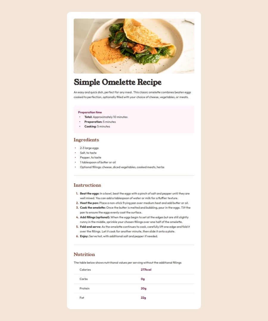
Design comparison
Solution retrospective
I genuinely implemented the design system in a way that it can be reused as a variable across elements, also applying two sets of fonts the way it is described in the challenge.
What challenges did you encounter, and how did you overcome them?The margin or spacing above and bellow the body by removing 'height: 100%' in the html tag element then replacing it with padding as well as setting the body height to 'fit-content'.
What specific areas of your project would you like help with?I think my code have inconsistencies with it's responsiveness especially with media queries and fonts as well as my spacing with paddings across each ul/ol elements since I need to modify it's pseudo selectors to be able to change its appearance, lastly I don't think my border radius are that consistent throughout the whole page and the hierarchy of each text elements and it's sizes.
Community feedback
- @DylandeBruijnPosted 4 months ago
@RedDotz20
Hiya! 👋
Congratulations on your solution, it looks very close to the design! I can tell you put a lot of effort into it.
Things I like about your solution 🎉
- Use of semantic HTML elements
- Clear descriptive CSS classes
- Use of CSS custom properties
Things you could improve ✍️
-
Try experimenting with the CSS layout tool Flexbox, it will help you greatly structuring elements on your webpage.
-
You could add a
min-height: 100vh
to yourbody
element so it takes up the full height of the viewport while still being able to grow when the content inside it grows. -
On most elements you don't need a
min-width
. -
You can remove the
height: fit-content
on yourbody
element. By default thebody
hasheight: auto
which basically does the same thing. -
Try reading up a bit on CSS cascade and inheritance. By putting some defaults on your
body
like afont-family
and standardfont-size
other (children) elements will inherit these properties.
I would put all this on the
body
:* { font-family: OutFit, sans-serif; margin: 0; padding: 0; box-sizing: border-box; color: var(--dark-charcoal); font-size: 1rem; }
I hope you find my feedback valuable, and I would appreciate it greatly if you could mark my comment as helpful if it was! 🌟
Let me know if you have more questions and I'll do my best to answer them. 🙋♂️
Happy coding! 😎
Marked as helpful1
Please log in to post a comment
Log in with GitHubJoin our Discord community
Join thousands of Frontend Mentor community members taking the challenges, sharing resources, helping each other, and chatting about all things front-end!
Join our Discord