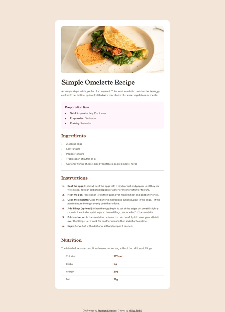
Responsive recipe page using semantic HTML5, CSS and media queries


Design comparison

Solution retrospective
In this project I learned how to use media queries and how to have a mobile-first workflow. This workflow made building the solution much easier, since I had to adjust only a few things once the mobile styling and layout was done.
What challenges did you encounter, and how did you overcome them?I wasn't sure if it is better to limit width of an article element or put margins on larger screens to make the article the correct size. I went with margins in the end because it looked better.
What specific areas of your project would you like help with?I wanted to try and use Bootstrap in this project but I figured this isn't the project to test it on. I want to try and use it but I'm not sure when.
Community feedback
- P@MATBMSPosted 10 days ago
Hi, Very nice work! A little improvement is to add a little margin left on your bullet point on your list. Keep coding!
0P@milicaaa175Posted 10 days ago@MATBMS Thank you! I tried to fix that but I don't know how when the bullet position is outside. Whatever I did nothing changed, do you have a solution for this?
0P@MATBMSPosted 9 days ago@milicaaa175 just increase your padding.
ul {
    padding-left: 1.25rem;
}
Marked as helpful0

Please log in to post a comment
Log in with GitHub
Join our Discord community
Join thousands of Frontend Mentor community members taking the challenges, sharing resources, helping each other, and chatting about all things front-end!
Join our Discord