Submitted 4 months ago
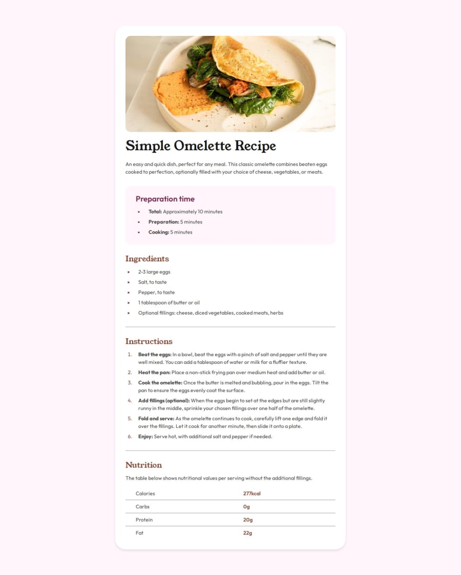
Responsive recipe page using HTML, CSS
#accessibility#semantic-ui

P
@SuhasPatnaik

Design comparison
SolutionDesign

Solution retrospective
What are you most proud of, and what would you do differently next time?
Made the website fully responsive across smaller devices (tablets, mobiles, etc) using responsive units, flexible images and media queries for the first time.
Possible Improvement:
I personally feel like there’s a more efficient approach to making a website fully responsive. For instance, I’d like to break slightly complex components into flexboxes and grids wherever possible to build fluid layouts from the start.
What challenges did you encounter, and how did you overcome them?- Figuring out the approaches to manipulate the stylings of a list item and choosing the more suitable one for my use case (used
::markerinstead of::before) - Learning about table border manipulations, on how it is designed for table cells by default but I had to adapt it to table row instead to fit the design requirements.
In terms of accessibility and ways to achieve responsiveness.
Community feedback
Please log in to post a comment
Log in with GitHub
Join our Discord community
Join thousands of Frontend Mentor community members taking the challenges, sharing resources, helping each other, and chatting about all things front-end!
Join our Discord