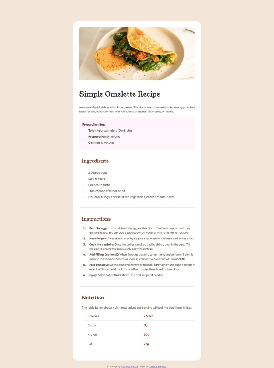
Design comparison
Solution retrospective
I had some difficulties with spacing the bullet points. What method did you use?
Community feedback
- @grace-snowPosted 9 months ago
In the CSS I see two very big problems and other recommendations
- Remove the min width from the body. That is what is causing the overflow bug.
- Font size must never be in px
- Always use a modern css reset at the start of the styles in every project. Andy Bell has a good one you can look up and use.
- This might be fine but it is hard to tell when I am away from my computer and can't check by inspecting in browser. Make sure you understand when to use padding vs margin
- There should be no widths or heights anywhere in this. That will also be causing the overflow bug. All the main component needs is a single max width in rem.
- If styles repeat don't place the same styles on 3 classes. Just use the one class and place it wherever it's needed in the html, however many times that is.
- You should (almost) always be styling mobile first and definitely should be in this. Mobile styles should be the default, then override the properties that need to change for larger screens in a min width media query.
- Media queries must be defined in rem or em not px
- Do not use width 100vw. Viewport units don't account for scrollbars or device notches so all that can do is cause overflow bugs.
Marked as helpful1@IrinaKrdmvaPosted 9 months ago@grace-snow First of all, let me thank you for all of your insights, they have been very helpful. This is why I love Frontend Mentor, all the help from the senior developers is welcome and appreciated. I have made all the changes you suggested and have looked also at the articles. I had no idea that the alt text was so important, they didn't teach us this, but it has been eye opening. Keep up the good work and thank you again for taking your time to review my code😁👍
1 - @grace-snowPosted 9 months ago
I'm afraid this is badly overflowing my phone screen.
But before fixing styling issues some html changes are needed:
- never add an empty landmark. This design doesn't show a header
- read about how and when to write alt text. There is a very good post in the resources channel on discord about this.
- the
btag is deprecated and should not be used. Did you mean strong perhaps? - I can't figure out from the design why you would need all these spans with the bullet class... The design looks to be using standard markers so I don't think that class would be necessary
- data tables must use header cells so it is programmatically clear which content is the header.
- Headings must go in order. Never skip levels like this going from h1 to h3.
- it is better for performance to link fonts in the html head instead of css imports.
Marked as helpful1
Please log in to post a comment
Log in with GitHubJoin our Discord community
Join thousands of Frontend Mentor community members taking the challenges, sharing resources, helping each other, and chatting about all things front-end!
Join our Discord
