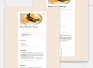
Design comparison
Community feedback
- @CamrynTidsworthPosted about 1 month ago
Good job! The project looks similar to the design aside from some differing colors. The code is well structured and readable, especially the CSS.
Two suggestions:
-
There is room here to incorperate more descriptive HTML tags that will make the code more SEO friendly and accessible. For example, you could use tags like <ol> or <ul> for lists, and <table> for the nutrition table.
-
It may speed up your CSS process to start using custom properties for repeating colors. This can be done by using the var() function to set specific color values that you can then reference instead of writing out the entire hsl value every time.
Marked as helpful0 -
Please log in to post a comment
Log in with GitHubJoin our Discord community
Join thousands of Frontend Mentor community members taking the challenges, sharing resources, helping each other, and chatting about all things front-end!
Join our Discord
