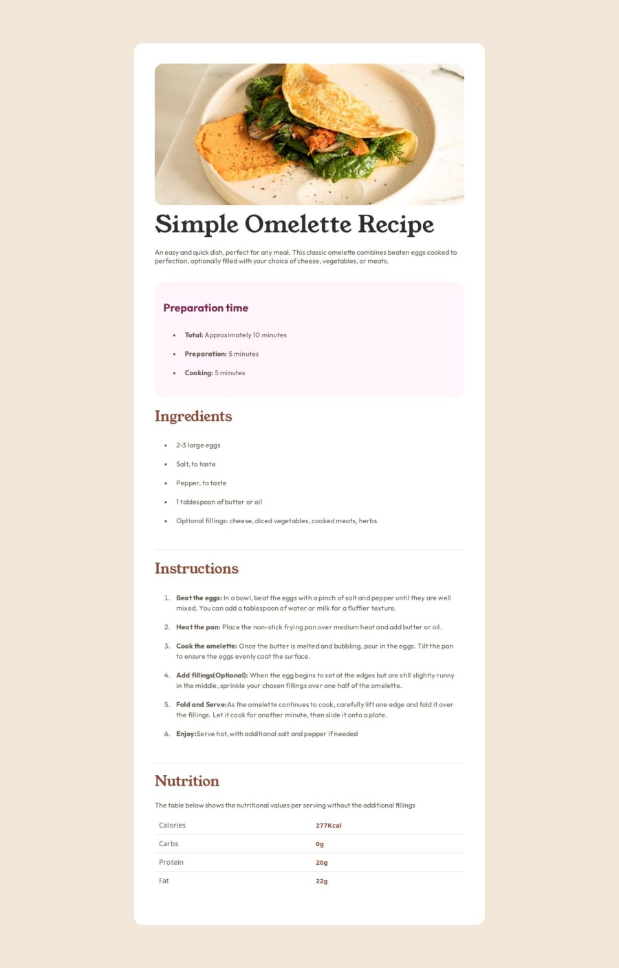
Responsive Recipe Page using HTML and CSS
Design comparison
Solution retrospective
I'm proud that I have gotten better at coding in general
What challenges did you encounter, and how did you overcome them?Styling it to fit mobile view and adjusting the font width to match perfectly and also determining what font color to use
What specific areas of your project would you like help with?I would love to know how the numbers 1-6 were styled, I tried but I couldn't do it
Community feedback
- @justinconnellPosted about 1 year ago
Hi @DammyFaffy,
As per your request regarding making your design responsive you need to use a media query to apply different layouts such as the one below:
  .container {
    max-width: 375px;
  }
  @media (min-width: 768px) {
    .container {
      max-width: 736px;
    }
The code above takes a 'mobile first approach' and sets the maximum width for a container - for mobile the max-width is 375px and on screens larger than 768px, the max-width is 736px.
The key is to use media queries to define styling for specific screen sizes. Starting with the mobile first approach and moving up screen sizes helps to simplify the process.
You can learn more about mobile first here
I do have a question for you though, what resources are you currently using to learn web development?
I hope you find this useful
Keep on coding and learning! J
Marked as helpful0
Please log in to post a comment
Log in with GitHubJoin our Discord community
Join thousands of Frontend Mentor community members taking the challenges, sharing resources, helping each other, and chatting about all things front-end!
Join our Discord
