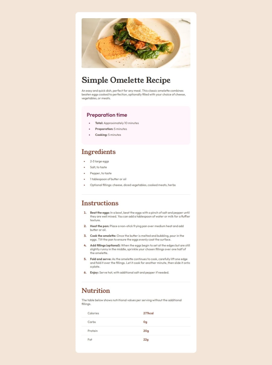
Responsive Recipe page using Flexbox and Media queries
Design comparison
Community feedback
- P@JA-307020Posted 8 months ago
I like how responsive the page is and how you used variables and some unusual pseudo-selectors like :not. However I believe that the <section> within a <section>, all within an <article> is a bit redundant. Basically if the whole page is an article then you can use individual sections, no need to wrap everything in another section. Hope that makes sense. Thanks for reading and keep up the good work! :)
0P@barka-devPosted 8 months ago@JA-307020 Thanks for your comment. I totally agree with you. However, I wanted to group everything except the image and apply padding once for everything for the mobile display, because as you can see in the mobile design, the whitespace around the image has disappeared, while the rest of the content retains that space. Maybe there is a better approach to achieve the same result. I will try to figure it out next time :)
0
Please log in to post a comment
Log in with GitHubJoin our Discord community
Join thousands of Frontend Mentor community members taking the challenges, sharing resources, helping each other, and chatting about all things front-end!
Join our Discord
