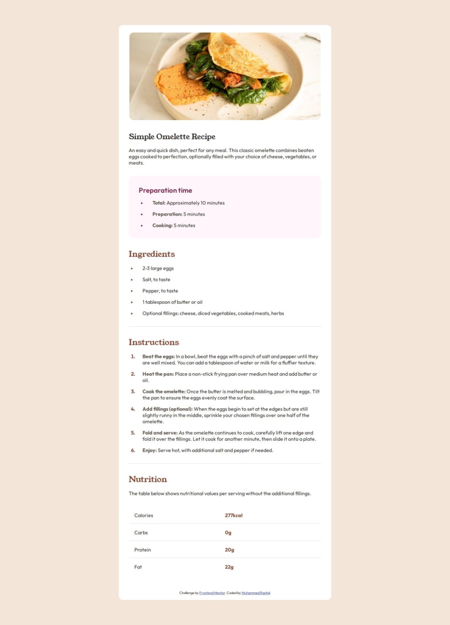
Design comparison
Solution retrospective
This was my first serious independently coded html css project. I'm proud of the fact that I took time to plan out the project before I started which kept me focused and on track during the actual coding. Even just a simple sketch on paper worked well to put the bigger picture in view when I was entrenched in a coding problem. I also adapted and used the checklist provided by frontendmentor which really helped in the management side of the project. I believe having this structured, methodical approach allowed me to complete this project in under 2 days
Next time, I would think through the html structure and css styles more thoroughly before starting the markup and styling phases respectively. This is because I fell into a few pitfalls and inefficiencies which could have been avoided with better thought and planning. So I would definitely create a more detailed plan before starting any coding. Also, I plan to refresh my knowledge on css by going through the css section on W3 schools
What challenges did you encounter, and how did you overcome them?-
Uploading to GitHub. I took a course but had forgotten a lot of it since I rarely used it in practise. Refreshed my knowledge on the key commands
-
Responsive design: The image had to latch onto the border of the container at 375px. My problem was I had initially kept the image inside the flexbox but this meant I couldn't get it to fill the padding of the container while inside a flexbox. So I took it out and placed it above the flexbox
-
Getting overwhelmed by all the different elements to style. Split the styling phase into phases -- first style elements individually going down the page (don't worry about DRY just yet); extract the universal and body styles; finally review and tidy up the styles: test them, group, delete
-
Responsive design. Needed a recap on the material
-
Tables. Hadn't worked with them before so had to learn
-
Adding the horizontal ruler lines in between the table rows. This was probably the most annoying issue to solve, and I still don't have a design that matches the briefing. After looking at tutorials on YT, I've discovered that it can be done by NOT using the table element directly, but constructing it out of divs and paragraphs where the paragraphs form the data cells and their wrapping div forms the row and is set as a flexbox to space out the cells. I haven't incorporated this into my code, however as I felt it would be quite an overhaul
-
Do you have any other suggestions for getting the horizontal ruler lines inside the table? Is there a way to get those lines using the html table element, and ensure they are complete lines without a gap in the middle where a data cell ends?
-
What suggestions, tips and best practises do you have for planning out the markup?
-
How can I write clean css the first time round? Any ideas to help move me in that direction?
Community feedback
Please log in to post a comment
Log in with GitHubJoin our Discord community
Join thousands of Frontend Mentor community members taking the challenges, sharing resources, helping each other, and chatting about all things front-end!
Join our Discord
