Design comparison
Solution retrospective
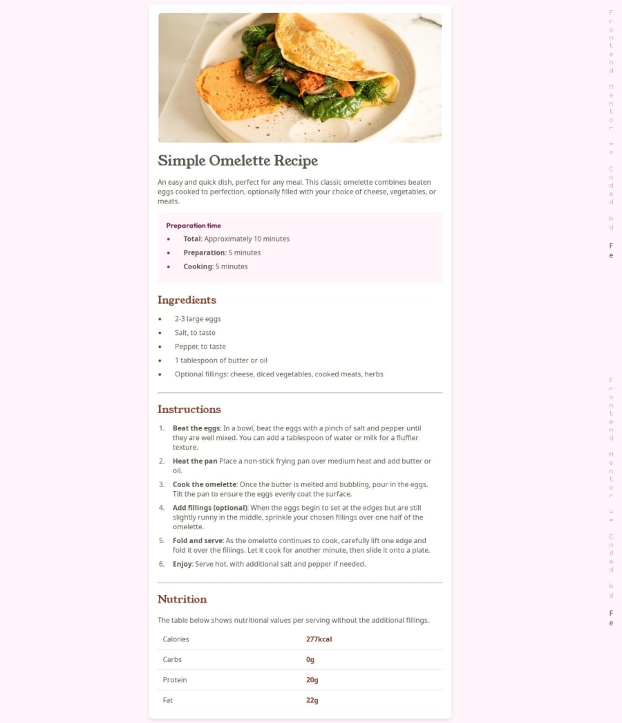
I tried something new on this project: vertical upright writing of my name that flows as you scroll the page. Usually, when I think about web design, I tell myself I'll try things when I'm more skilled even if I have a clear visual of what I wanna do. But today, I went for it, and it worked! I'm so proud of that.
What challenges did you encounter, and how did you overcome them?When I implemented the vertical upright writing mode, it was really hard to adjust it for responsive mobile devices. But in the end, I just added a new tag and hid the original one. Funny, right?
What specific areas of your project would you like help with?I am good as it is but I am open to any senior advices.
Community feedback
Please log in to post a comment
Log in with GitHubJoin our Discord community
Join thousands of Frontend Mentor community members taking the challenges, sharing resources, helping each other, and chatting about all things front-end!
Join our Discord
