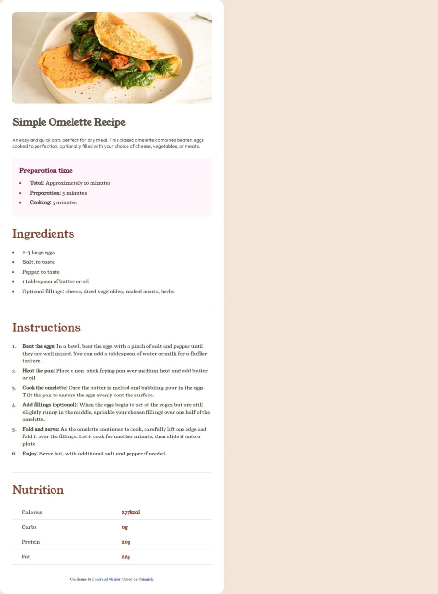
Responsive recipe page using CSS Grid and Flexbox
Design comparison
Solution retrospective
I am most proud of reasonably effectively getting information out of Figma in a more organised way. Checking the spacing and in this case decided to experiment with some utility classes for the spacing as the same basic spacing was used throughout.
Next time instead of simply magic numbering the spacing for the lists and the ::marker(s) I would prefer to have used the ::before pseudo element but for whatever reason I have always had a tough time using them.
Also as I in miniature made my own small utility class system it would almost be better to just go all in on utility classes vs mixing different styles of CSS together. Though, ultimately I guess i'll just learn tailwindcss v4...
What challenges did you encounter, and how did you overcome them?I am not sure that ultimately this was super challenging. Though when I get to the next page and see the snapshot, I suppose i'll find out :)
Styling the table of calories etc I made overly complex using Flexbox I think 4 times, instead of just named grid areas.
What specific areas of your project would you like help with?If you are an experienced Git user I would really appreciate feedback on my use of git issues and/or commits. As I really tried to prioritise clean commits, but some really weren't.
I broke my CSS file up into multiple different files and would appreciate feedback as to how easy to grasp this is and whether I could improve this structure as I think it could be improved.
Community feedback
Please log in to post a comment
Log in with GitHubJoin our Discord community
Join thousands of Frontend Mentor community members taking the challenges, sharing resources, helping each other, and chatting about all things front-end!
Join our Discord
