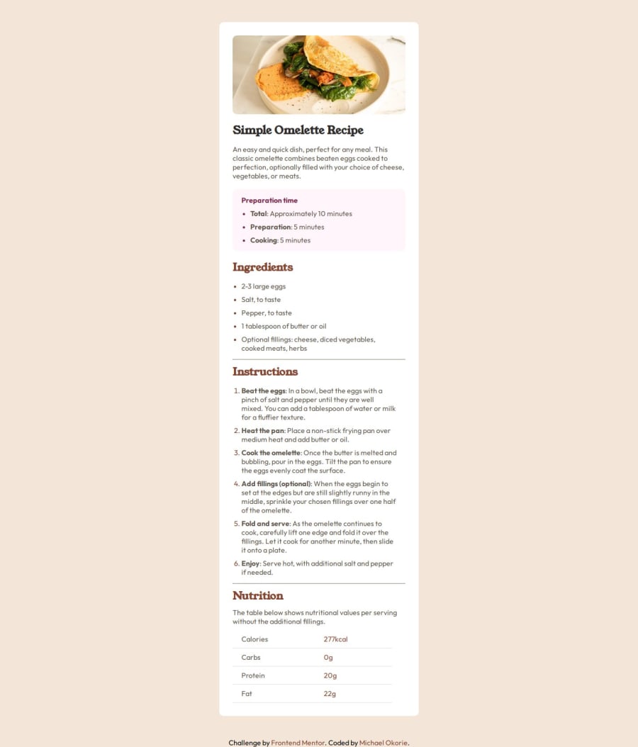
Responsive Recipe Page using CSS Flexbox
Design comparison
Solution retrospective
I'm most proud of how I structured the layout using CSS Grid and Flexbox to create a fully responsive and visually appealing recipe page. I also focused on accessibility by using semantic HTML elements and proper contrast ratios.
Next time, I would experiment with CSS animations to enhance the user experience and possibly integrate React to make the page more dynamic. I’d also like to explore dark mode support for better usability.
What challenges did you encounter, and how did you overcome them?One of the main challenges was ensuring perfect responsiveness across different screen sizes. Initially, I struggled with some alignment issues in the layout, especially with images and text spacing. I overcame this by using a mobile-first approach and testing with various breakpoints.
What specific areas of your project would you like help with?** I would love feedback on: **
-
Best practices for optimizing accessibility in recipe pages.
-
Performance improvements—are there better ways to optimize images and styles?
-
Code structure—any tips on making my CSS cleaner and more maintainable?
-
If you have any suggestions on how to make the page more interactive, I’d appreciate the insights!
Community feedback
Please log in to post a comment
Log in with GitHubJoin our Discord community
Join thousands of Frontend Mentor community members taking the challenges, sharing resources, helping each other, and chatting about all things front-end!
Join our Discord
