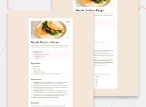
Design comparison
Community feedback
- @Yaqoob1410Posted 6 months ago
To achieve a design that is visually harmonious and appealing, it is crucial to adjust the font to align closely with the overall aesthetic and layout of the project. The font choice significantly impacts readability, mood, and the effectiveness of the design's communication. Here are several key steps to refine the font selection:
-
Understand the Design Context: Evaluate the overall theme and purpose of the design. Is it formal or casual, modern or vintage? The font should complement these elements.
-
Match the Tone: Choose a font that reflects the tone of the content. For instance, a serif font may convey tradition and reliability, while a sans-serif font might suggest modernity and simplicity.
-
Consider Readability: Ensure the font is legible at various sizes, particularly for body text. Readability is paramount in maintaining user engagement and delivering the message effectively.
-
Maintain Consistency: Use a limited number of font families to avoid a cluttered appearance. Typically, one or two fonts (one for headings and one for body text) are sufficient.
-
Align with Layout: Adjust font sizes, weights, and spacing to fit seamlessly within the layout. This alignment enhances the overall balance and flow of the design.
By carefully selecting and adjusting the font, you can create a cohesive and aesthetically pleasing design that enhances the user experience and effectively communicates the intended message.
0 -
Please log in to post a comment
Log in with GitHubJoin our Discord community
Join thousands of Frontend Mentor community members taking the challenges, sharing resources, helping each other, and chatting about all things front-end!
Join our Discord
