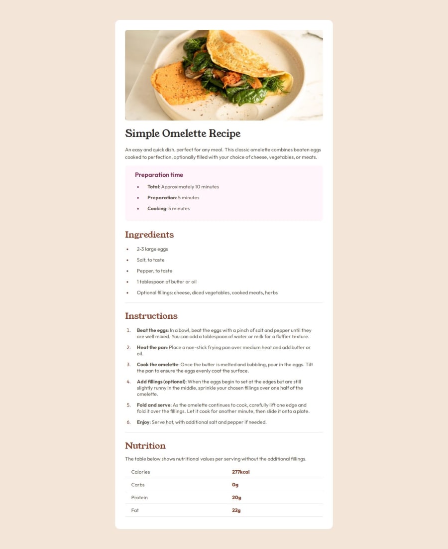
Responsive Recipe Page using CSS Flexbox


Design comparison

Solution retrospective
I'm most proud of how clean and structured the design is. The use of CSS variables, Google Fonts, and well-thought-out spacing makes the recipe page visually appealing and easy to read. The mobile responsiveness is also a highlight, ensuring a great user experience on different screen size.
Next time, I might focus more on adding interactivity with JavaScript, such as collapsible sections for ingredients and instructions. Additionally, I could improve accessibility by ensuring proper semantic HTML, adding ARIA attributes where necessary, and optimizing keyboard navigation. Another enhancement could be experimenting with animations or transitions to make the page more dynamic.
What challenges did you encounter, and how did you overcome them?-
Maintaining a Clean and Organized CSS Structure.
-
Making the Page Visually Engaging Without JavaScript
-
CSS Optimization & Best Practices: Could the structure of my CSS be improved for better maintainability?
-
Enhancing User Experience (UX): Would adding subtle animations (e.g., hover effects or transitions) enhance the experience without overcomplicating the design?
-
Potential JavaScript Enhancements: Would features like collapsible sections for ingredients/instructions be a good addition?
Community feedback
- @Sage-25Posted 26 days ago
This is a good implementation, not further feedback.
0

Please log in to post a comment
Log in with GitHubJoin our Discord community
Join thousands of Frontend Mentor community members taking the challenges, sharing resources, helping each other, and chatting about all things front-end!
Join our Discord