Submitted about 1 year ago
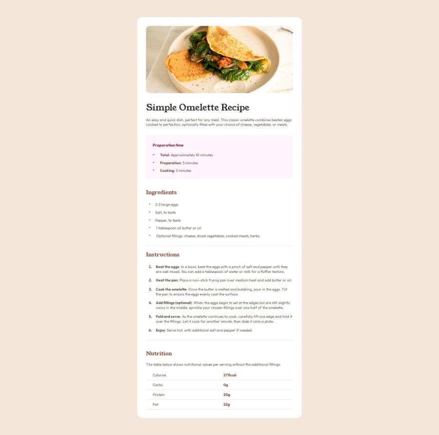
Responsive recipe page using CSS Flex and Grid

P
@Antonvasilache

Design comparison
SolutionDesign

Solution retrospective
What are you most proud of, and what would you do differently next time?
- Creating multiple lists with custom bullet points, applying common formatting, and then customizing each, as so:
.prep-list-item::before,
.ingredients-list-item::before,
.instructions-list-item::before {
  content: "•";
  font-size: 1rem;
  color: var(--Nutmeg);
}
- Creating the media queries to match the mobile design file.
- Creating the table by using grid in a simple and effective way.
- Grouping up the lists to apply common attributes, before styling them individually. I tried to not repeat myself, but it took longer than writing them separately.
- Tried to create the table using the `` tag, but couldn't add margins and borders at the same time, so I switched to grid
- Figuring out how to follow the mobile design properly, without changing the page structure
- Not sure if it is the best way to implement the mobile design.
Community feedback
Please log in to post a comment
Log in with GitHub
Join our Discord community
Join thousands of Frontend Mentor community members taking the challenges, sharing resources, helping each other, and chatting about all things front-end!
Join our Discord