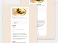
Design comparison
Solution retrospective
Hi I am Johannes and this is my solution on this challange.😊
I had some problems with creating an solid line for the table. I also didn't know a better solution for the media querry.
Any Feedback is welcome
Community feedback
- @rahulkumar215Posted 8 months ago
Hello @Johannes-pries👋
Congratulations on successfully completing the challenge! 🎉
I have a suggestion regarding your code that I believe will be of great interest to you.
- In Nutrition section of your solution, the last row has a
border-bottom, however in the design, there is no border in the last row,
so this will be easy just do this,
.table-nutrition table { width: 100%; text-align: left; font-family: "Outfit"; border-collapse: collapse; }and remove this
.table-nutrition td { //remove this border-bottom line border-bottom: 1px solid var(--Light-Grey); padding: .6rem 0 .6rem 1.5rem; }and add this
.table-nutrition tr:not(:last-child){ border-bottom: 1px solid var(--Light-Grey); }and done✅
I hope you find this helpful 😄 Above all, the solution you submitted is great !
If you need any feedback or suggestions, I am happy to help
Have Fun Coding!
Marked as helpful0 - In Nutrition section of your solution, the last row has a
- @jotaprojectsPosted 8 months ago
Great work with this!
Tables can be a bit tricky. I would suggest try add
border-collapse: collapseon your table and then you will get a solid line. By default a table has borders.Marked as helpful0
Please log in to post a comment
Log in with GitHubJoin our Discord community
Join thousands of Frontend Mentor community members taking the challenges, sharing resources, helping each other, and chatting about all things front-end!
Join our Discord

