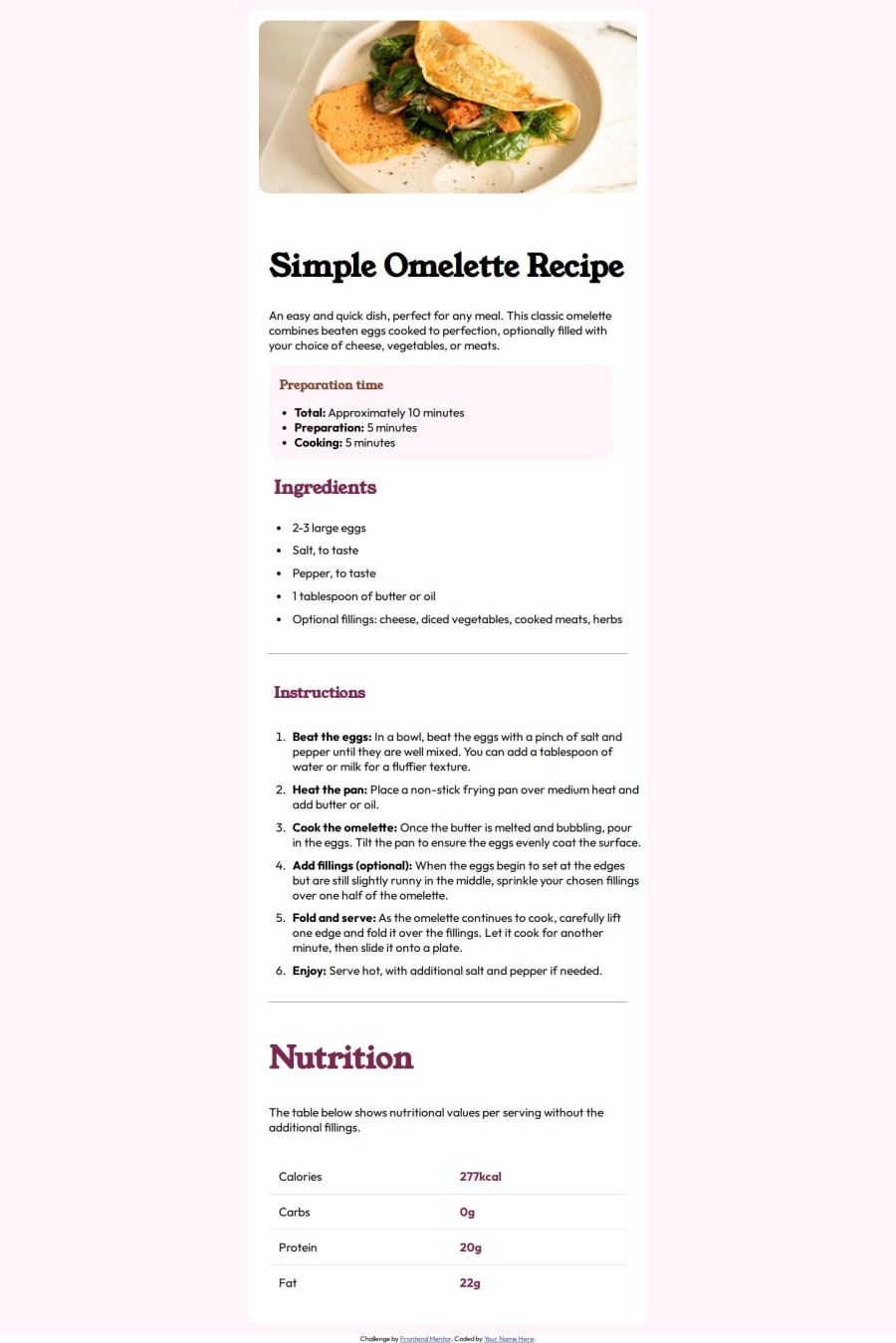
Responsive Recipe Page Template using HTML and CSS
Design comparison
Solution retrospective
I would love to tone down on the Font sizing for sure next time.
What challenges did you encounter, and how did you overcome them?Styling the table elements turned out a bit difficult. Took a while to get the hang of it.
Utilization of new attributes like the first-child etc also turned out to be challenging.
What specific areas of your project would you like help with?Help with the Font-sizing would be of great help. As you can see that I have made the fonts way to big. I was following the mobile first approach and it looked good on mobile but should I change the whole thing in the sizes above 768px? Or is there a better way.
The reason I ask this is because I have used them rem units but the size is not changing based on the browser size.
Any other advice would be welcomed!!
Community feedback
- @IrieBeePosted 7 months ago
Hi @KrishnaPoddar1,
You did a great job on this project!
I don't think they have different fonts for mobile and desktop designs. If you open mobile design and desktop design jpeg (in design folder that you downloaded) and make 100% view on both of them you can see that the text size is the same.
Have an awesome day and happy coding
0@KrishnaPoddar1Posted 7 months agoThank you @ltsyBitsy for taking the time to reply and also clarifying this for me.
1
Please log in to post a comment
Log in with GitHubJoin our Discord community
Join thousands of Frontend Mentor community members taking the challenges, sharing resources, helping each other, and chatting about all things front-end!
Join our Discord
