Design comparison
Community feedback
- @Dav1dGPPosted 11 months ago
Hi there!!
First of all, good job!!
Here are some suggestions for your solution:
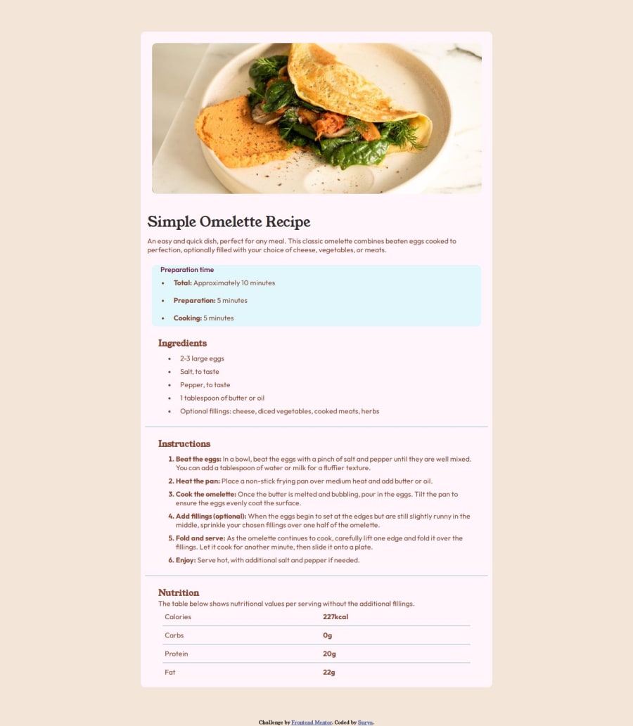
The alt attribute in the <img> tag should have descriptive text and you have it empty. This attribute is important because it is what will appear if the image fails.
On the other hand, in HTML5 it is more semantically correct to have the <footer> tag inside the <body> tag and not outside of it.
Finally, you have given a touch of different color to the design, but if you like it better this way, perfect.
Good luck in your next projects and enjoy typing!
Marked as helpful1@Surya-2004Posted 11 months ago@Dav1dGP Thanks for the suggestions its much appreciated
1
Please log in to post a comment
Log in with GitHubJoin our Discord community
Join thousands of Frontend Mentor community members taking the challenges, sharing resources, helping each other, and chatting about all things front-end!
Join our Discord
