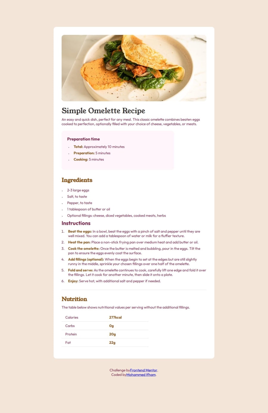
Design comparison
SolutionDesign
Solution retrospective
What are you most proud of, and what would you do differently next time?
this is the first time that I am taking a mobile-first approach so I am proud of myself.
What challenges did you encounter, and how did you overcome them?I find it hard when make judgments about padding, margin, and font sizes. If the Figma file is available for reference it would be great.
What specific areas of your project would you like help with?I spend a lot of time on vertically centered list markers. is there any better way to do this?
Community feedback
Please log in to post a comment
Log in with GitHubJoin our Discord community
Join thousands of Frontend Mentor community members taking the challenges, sharing resources, helping each other, and chatting about all things front-end!
Join our Discord
