Responsive Recipe page

Solution retrospective
- I'm consistent
- I manage to find easily solutions and answer to my problems and questions
- I am now putting effort to use betterHTML semantics thanks to @dakirzakaria
-
First of all, I learnt that I am really bad at estimating! I estimated I needed 200 minutes for this challenge, but I needed the double to polish everything… and I learnt it takes VERY long to do so
-
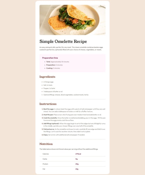
To stick to the design was particularly challenging. I made the conscious choice to deviate from the design regarding the bullets, because the solutions I found were hurting accessibility.
-
The nutrition table at the bottom was challenging and there were many ways I could approach it. I chose multiple divs over use of table. It worked but I am not sure that was the best solution.
I found this exercise particularly challenging when it came to keeping a CSS file simple, readable and easy to understand and maintain. I think I need better structure for big projects.
Please log in to post a comment
Log in with GitHubCommunity feedback
No feedback yet. Be the first to give feedback on Ralph's solution.
Join our Discord community
Join thousands of Frontend Mentor community members taking the challenges, sharing resources, helping each other, and chatting about all things front-end!
Join our Discord