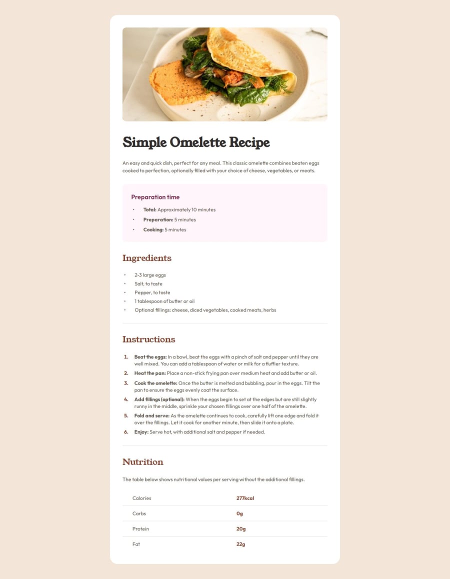
Design comparison
Solution retrospective
I am proud of finishing another challenge, although there are probably better ways of doing it.
What challenges did you encounter, and how did you overcome them?One of my main challenges so far has been centering the main component - in this case the recipe page container - right in the middle of the page. I have tried using flexbox before, I am using grid here, but for some reason I don't understand it is not centering properly. Also, I used padding on body to prevent the recipe container from sticking to the top and bottom of the page.
What specific areas of your project would you like help with?All feedback is very welcome and appreciated :)
Community feedback
- @mbtenkorangPosted 11 months ago
@aggie-l Congratulations 🎉🥳👏 on completing this challenge.
Some feedback in relation to the challenge you encountered;
-
To notice that your design choice for the
<body>element works you may view the webpage in the browser on a simulated 4K display using the Toggle device emulation feature - CTRL+SHIFT+M of the Developer console - CTRL+SHIF+I. -
A quick fix though, for mobile devices the
<body>element receives apaddingwhich based on the designs will be more suitable only in a media-query for desktop/larger displays. The padding should keep the page "centered" until the display is much much larger as you've done now. -
The
flexdeclaration for the.recipe-containercan be removed and the design will still hold because thepaddingvalue of the.recipe-containeris keeping all the elements in line at the along all edges
I hope this feedback helps. Great job 👍and happy coding 😁🧑💻
Marked as helpful1@aggie-lPosted 11 months ago@mbtenkorang Thank you very much for your feedback!! It's a huge help 😊
0 -
Please log in to post a comment
Log in with GitHubJoin our Discord community
Join thousands of Frontend Mentor community members taking the challenges, sharing resources, helping each other, and chatting about all things front-end!
Join our Discord
