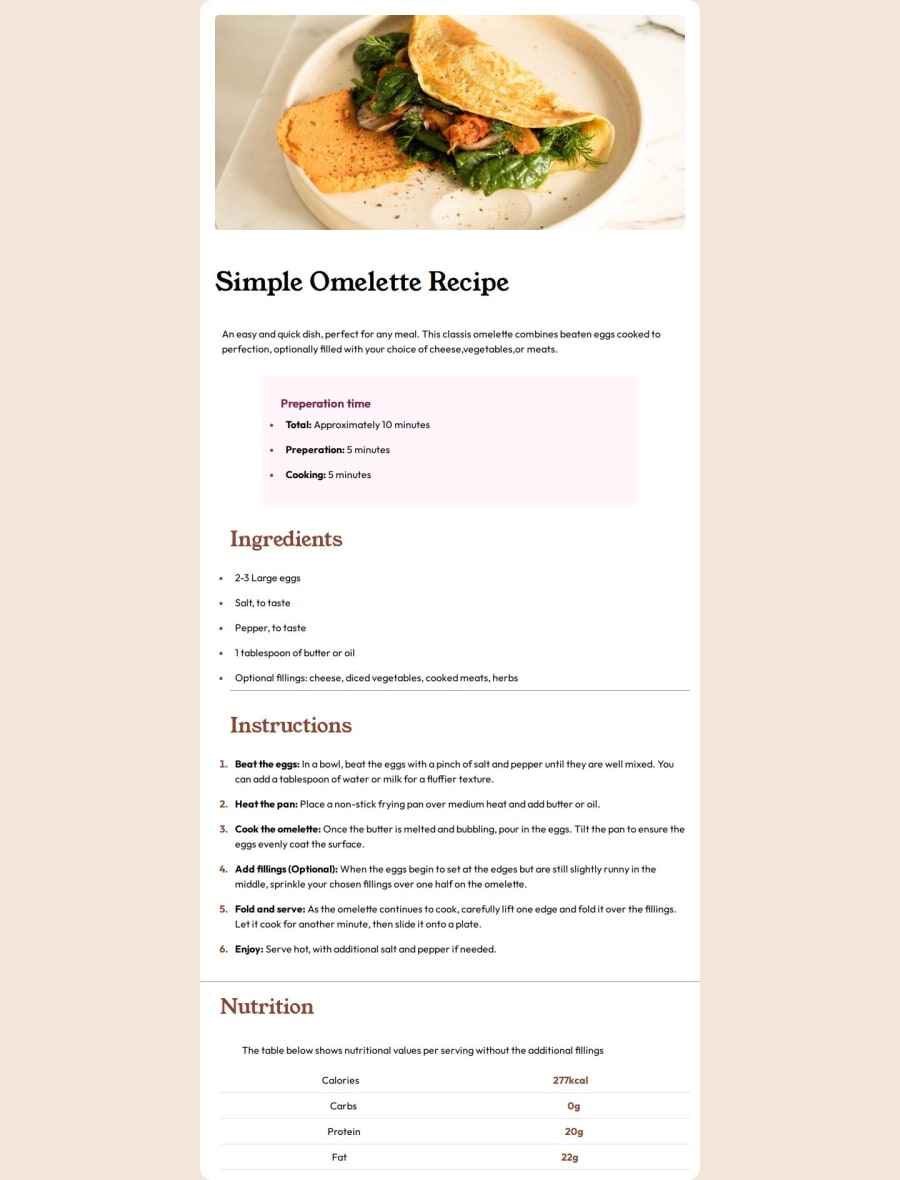
Design comparison
SolutionDesign
Solution retrospective
What are you most proud of, and what would you do differently next time?
I'm pretty happy with the way it's turned out although next time I build something from a design I'd remember to keep responsiveness in mind!
What challenges did you encounter, and how did you overcome them?I had to tweak the media query a few too many times, this was because the website was looking perfect on Microsoft Edge (The browser used when I open the link for my code on VS Code) but not responsive at all on Chrome. I changed the max-width in my media query to solve this problem
What specific areas of your project would you like help with?The responsiveness in general. What tips and tricks do others have when designing for mobile.
Community feedback
Please log in to post a comment
Log in with GitHubJoin our Discord community
Join thousands of Frontend Mentor community members taking the challenges, sharing resources, helping each other, and chatting about all things front-end!
Join our Discord
