Submitted about 1 year agoA solution to the Recipe page challenge
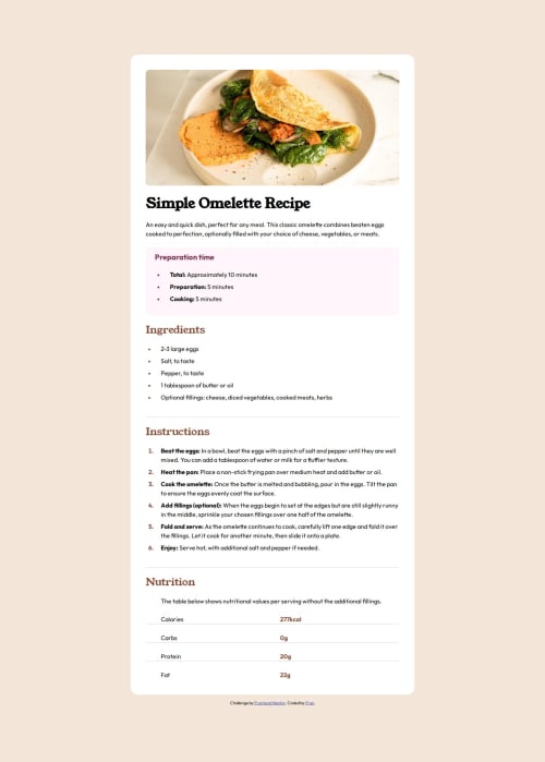
Responsive Recipe page main with media queries
bem, pure-css
@FranciscoMi

Solution retrospective
What are you most proud of, and what would you do differently next time?
I finally understood how media queries work to make a responsive design. Next time I will try flexbox and grid.
What challenges did you encounter, and how did you overcome them?The most difficult challenge has been to get the image to come out of its edges. It's very easy with media queries when you understand how they are used.
What specific areas of your project would you like help with?Would it be possible to get the responsive design and switch from desktop to mobile without using media queries? I would appreciate any feedback. Thanks
Code
Loading...
Please log in to post a comment
Log in with GitHubCommunity feedback
No feedback yet. Be the first to give feedback on Fran's solution.
Join our Discord community
Join thousands of Frontend Mentor community members taking the challenges, sharing resources, helping each other, and chatting about all things front-end!
Join our Discord