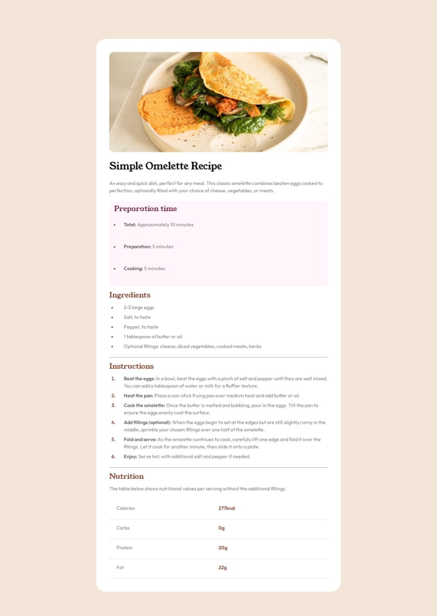
Design comparison
Solution retrospective
Selectors I am most proud of mastering CSS selectors and effectively styling elements without the need for excessive class names. Understanding how to target elements efficiently has streamlined my code and improved its readability. Additionally, successfully styling both ordered and unordered lists has been a significant achievement.
Moving forward, I would focus on enhancing the responsiveness of the layout. While I've made progress in this area, there's room for improvement to ensure the design adapts seamlessly across various screen sizes and devices.
What challenges did you encounter, and how did you overcome them?One notable challenge I encountered was styling lists, particularly when I was unsure about how to achieve the desired appearance. However, I effectively addressed this issue by seeking guidance from ChatGPT. Leveraging its knowledge, I gained insights into styling both ordered and unordered lists, allowing me to overcome the challenge efficiently.
What specific areas of your project would you like help with?I would appreciate assistance with refining the layout to improve its responsiveness further. While I've made efforts to optimize the design for various screen sizes, I believe there's still room for refinement in this aspect. Any guidance or suggestions on how to enhance the layout's responsiveness would be invaluable.
Community feedback
Please log in to post a comment
Log in with GitHubJoin our Discord community
Join thousands of Frontend Mentor community members taking the challenges, sharing resources, helping each other, and chatting about all things front-end!
Join our Discord
