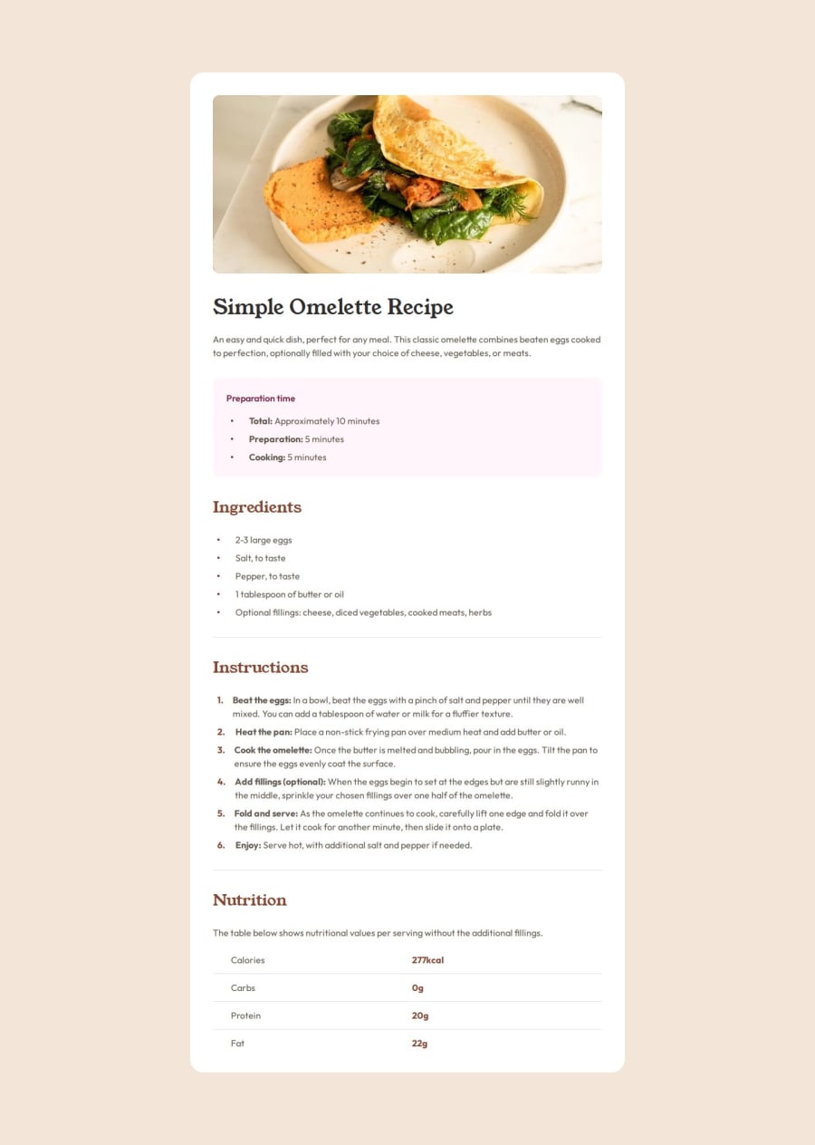
Responsive recipe page in React, Next.js, and tailwindcss.


Design comparison

Solution retrospective
I used a mobile first workflow this time, creating the mobile version first and then adding sm:px-[40px] for switching to tablet/desktop after I'd fully completed the mobile page.
During my conversion over to desktop I wasn't setting the mobile values that were now required since I was overriding them for small and larger screens. Next time I'll be sure to add those values when I'm adding the sm conditional classes.
I also tried setting up the Google fonts used straight in tailwind rather than loading them using Next.js. I like this better I think since it keeps all of the styling in one place potentially. I'm going to keep using this technique unless there is a good reason not to.
What challenges did you encounter, and how did you overcome them?My challenge this time was figuring out why my UI wasn't scaling back down correctly to mobile sizes once I'd scaled up to desktop size.
Took me a bit to figure out that because I wasn't specifying a default value, it wasn't switching correctly at the size breakpoints.
So, for instance rather than having:
<div className="sm:rounded-3xl" />
I needed to use:
What specific areas of your project would you like help with?<div className="rounded-none sm:rounded-3xl" />
I'd like help potentially organizing the breakdown of React components that I chose to use in this project to see if there are potentially cleaner ways to organize it.

Join our Discord community
Join thousands of Frontend Mentor community members taking the challenges, sharing resources, helping each other, and chatting about all things front-end!
Join our Discord