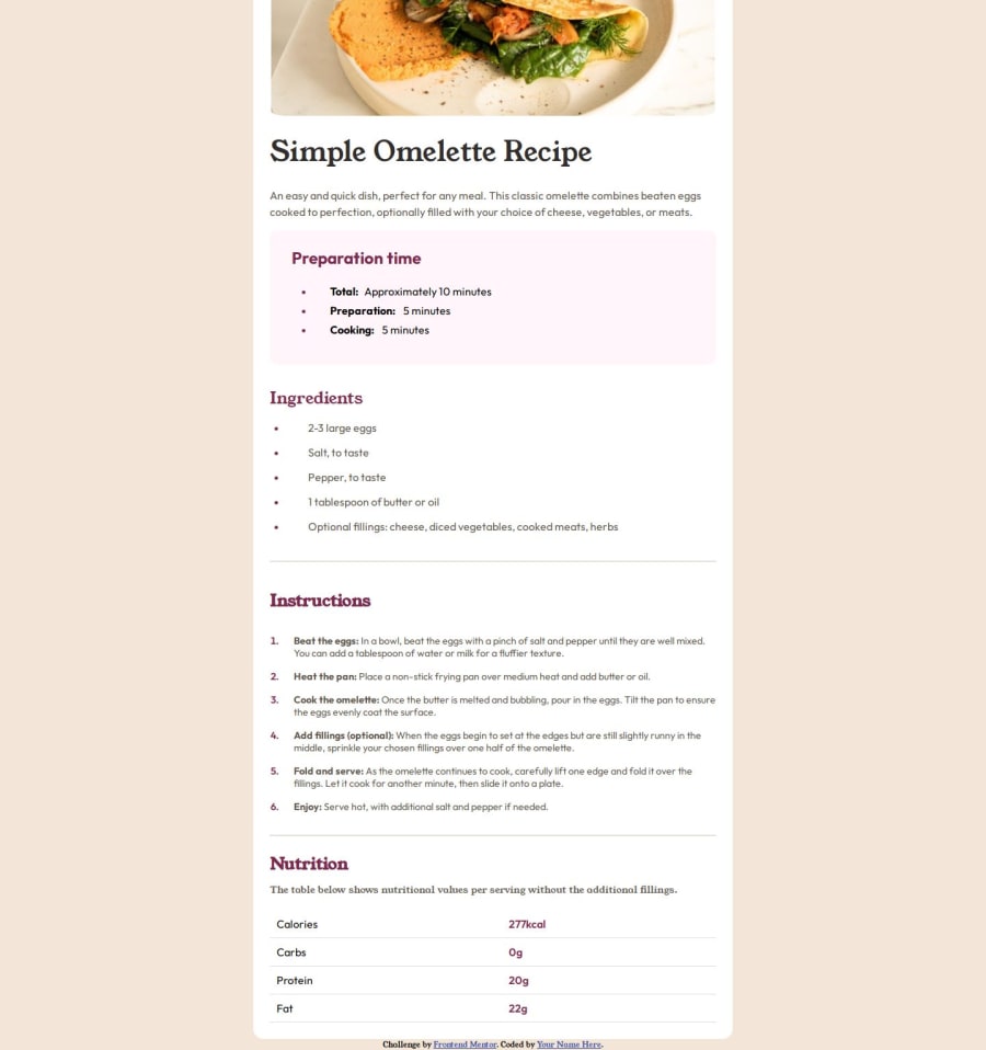
Design comparison
Solution retrospective
I am glad I felt more in the hang of getting back into doing things for frontend slowly after over a year break really from consistent coding.
What I am proud of: the majority of the website I feel is very well designed, I would however try to be more consistent with using re-useable class names to avoid bloat to css and better modular design. i.e; not doing specific classes for each section title, an just having a title class that handles all, primary font class, etc as opposed to adding that as a css variable for each class already having a singular class set up.
What challenges did you encounter, and how did you overcome them?Figuring out how to select the list "bullets" or "numbers" (hint: its ::marker), the table section at the bottom was difficult was well but I used CDN from firefox for looking up rules for tables, as I had not used tables really before. Originally tried to tackle the problem through grid but it made my head hurt.
What specific areas of your project would you like help with?General feedback on it. I'm aware a lot is lacking in terms of accessability, and aria-labels which is something I am going to look at and read more on going forward as I continue to do frontendmentor projects/challenges.
Community feedback
Please log in to post a comment
Log in with GitHubJoin our Discord community
Join thousands of Frontend Mentor community members taking the challenges, sharing resources, helping each other, and chatting about all things front-end!
Join our Discord
