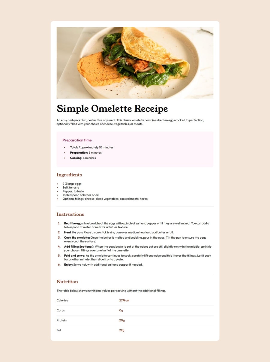
Design comparison
SolutionDesign
Solution retrospective
What specific areas of your project would you like help with?
I am sure I missed many small details as I rushed it a bit, tell me if there are big issues that can easily be fixed or something I should not do going forward
Community feedback
- @EfthymiosKPosted about 2 months ago
hi! I can mention some of the diferences I see between the design and your solution:
-The card container needs more border-radius and as well as the image. -The card dimensions dont look acurrate. Yours look wider than design. -You need to pick the right color for the text in your lists and paragraphs. -In design there is more space between lines in the ingredients list. Perphaps add some padding or margin.
- The first column of your table needs lef padding. you can achieve that by adding a class to the first column tds and using it in CSS. Overall I think it was a good try and with some improvement it will be perfect!
0
Please log in to post a comment
Log in with GitHubJoin our Discord community
Join thousands of Frontend Mentor community members taking the challenges, sharing resources, helping each other, and chatting about all things front-end!
Join our Discord