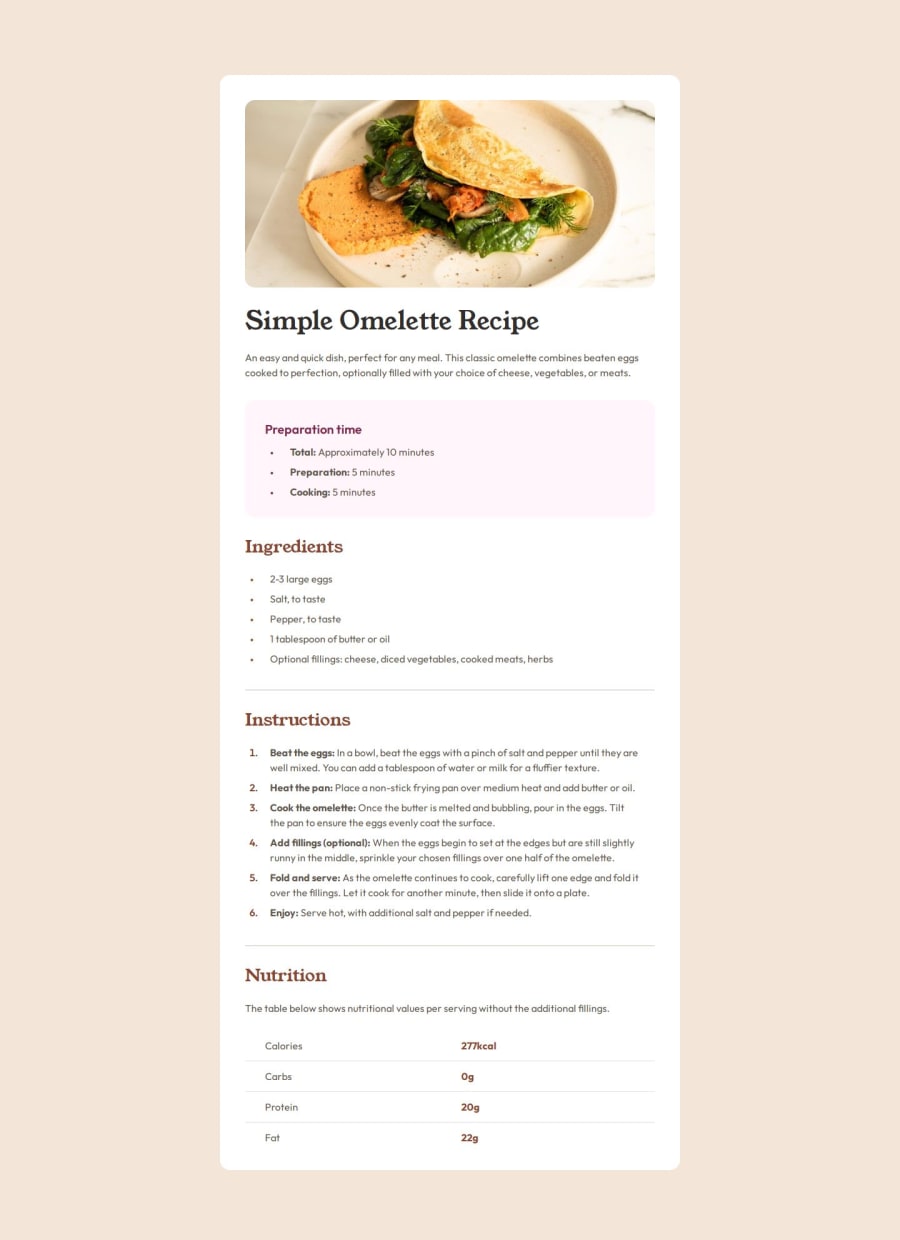
Responsive Recipe Page for Desktop/Mobile using HTML and CSS


Design comparison

Solution retrospective
The solution works for both desktop and all mobile screens, as intended, and looks near perfect compared to the provided design, which is great :)
I found myself to go back and restructure some of the HTML to make the transition from desktop to mobile more effective. Perhaps it would be smart to adopt a mobile-first approach next time.
What challenges did you encounter, and how did you overcome them?I used some time on figuring out how to implement the styling on the various lists in the solution, however after some research I solved it through overriding some styles for certain child elements!
What specific areas of your project would you like help with?I find spacing to be an area of styling where I spend a lot of time trying to perfect it based on the provided design (keep in mind I have no PRO subscription). I often use padding, sometimes margin, and try to make these scalable in scenarios I find it to be necessary. Would love some tips on how to simplify the spacing approach!
Community feedback
Please log in to post a comment
Log in with GitHub
Join our Discord community
Join thousands of Frontend Mentor community members taking the challenges, sharing resources, helping each other, and chatting about all things front-end!
Join our Discord