Not Found
Not Found
Not Found
Not Found
Not Found
Not Found
Not Found
Not Found
Not Found
Not Found
Not Found
Not Found
Not Found
Not Found
Not Found
Not Found
Not Found
Not Found
Not Found
Not Found

Submitted

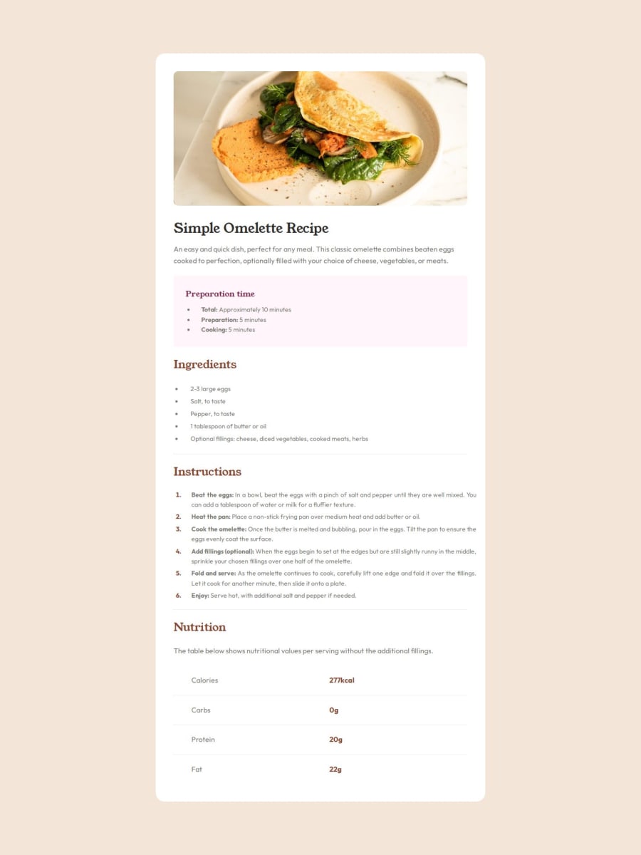
Responsive Recipe Page (Flexbox + Media Queries)

P

@mussieh

Desktop design screenshot for the Recipe page coding challenge

This is a solution for...

  • HTML
  • CSS
1newbie
View challenge

Design comparison


SolutionDesign

Solution retrospective


What are you most proud of, and what would you do differently next time?

I was able to complete the project in a few hours. I think I might use a framework next time.

What challenges did you encounter, and how did you overcome them?

I faced a challenge with the responsiveness but was able to figure it out in the end.

What specific areas of your project would you like help with?

I would love any feedback on the correctness of my approach to the challenge.

Community feedback

Riska997 110

@Riska997

Posted

Great job on completing the project!

  • Your code is easy to understand because you've used clear class names and added comments where needed. - You made sure your webpage looks good on different devices by using media queries.
  • Also, your typography system gives clear rules for fonts, making everything look nice together.

Some improvements

  • Consider grouping related CSS rules together, such as all styles for the .section-omelette-recipe, .section-preparation-time, etc.
  • This can enhance readability and maintainability, especially as your stylesheets grow.
/* Group related styles together */
.section-omelette-recipe,
.section-preparation-time,
.section-ingredients,
.section-instructions,
.section-nutrition {
    /* Your styles */
}
  • Instead of .omellete-recipe-header, you can simply use h1.omellete-recipe-header.
  • This helps in reducing specificity and makes your CSS more efficient.
/* Simplify selectors */
.omellete-recipe-header {
    /* Your styles */
}
  • In some cases, you're using pixel values for font sizes (font-size: 2.5rem) while in others, you're using rem.
/* Normalize font sizes */
h1, h2, h3 {
    font-size: 2.5rem;
}
  • Ensure that all images have appropriate alt attributes for accessibility purposes.
/* Ensure accessibility */
.img-omelette {
    /* Your styles */
}

Overall, you've done a commendable job

Keep up the great work!

Marked as helpful

1

P

@mussieh

Posted

@Riska997 thanks for the detailed breakdown. I will make sure to improve on what I can.

1

Please log in to post a comment

Log in with GitHub
Discord logo

Join our Discord community

Join thousands of Frontend Mentor community members taking the challenges, sharing resources, helping each other, and chatting about all things front-end!

Join our Discord