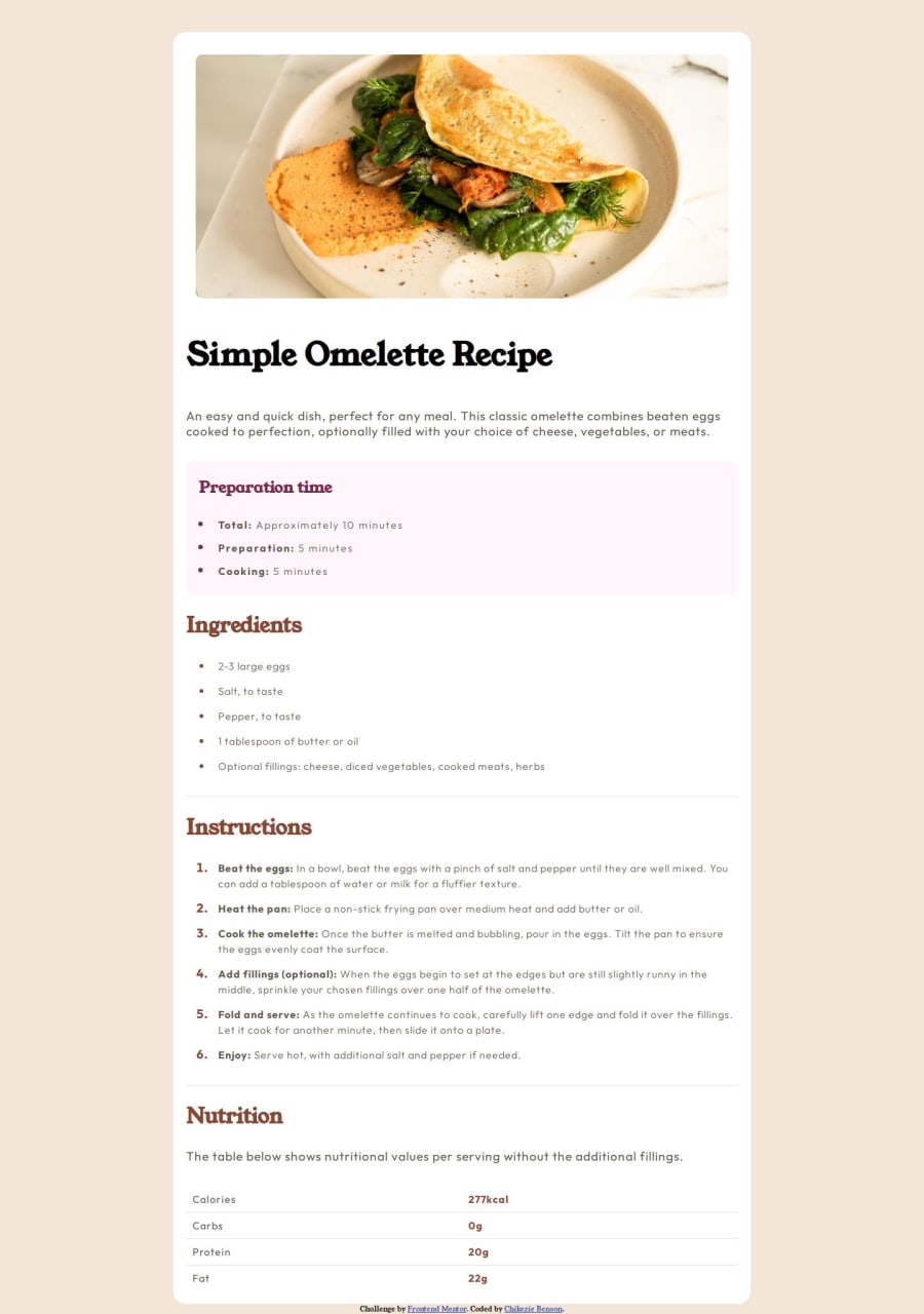
Design comparison
Solution retrospective
I was able to add an inside border radius to a box using the radial gradient. This was done for the desktop design.
Here:
{
background: radial-gradient(circle at 0 100%, white 14px, white 15px),
radial-gradient(circle at 100% 100%, white 14px, white 15px),
radial-gradient(circle at 100% 0, white 14px, white 15px),
radial-gradient(circle at 0 0, white 14px, white 15px);
background-position: bottom left, bottom right, top right, top left;
background-size: 50% 50%;
background-repeat: no-repeat;
padding: 10px;
}
What challenges did you encounter, and how did you overcome them?
I found it hard to curve the inside of my image container (setting a border-radius on the image itself leaves unwanted space on the edges). I used the radial-gradient CSS trick for it.
{
background: radial-gradient(circle at 0 100%, white 14px, white 15px),
radial-gradient(circle at 100% 100%, white 14px, white 15px),
radial-gradient(circle at 100% 0, white 14px, white 15px),
radial-gradient(circle at 0 0, white 14px, white 15px);
background-position: bottom left, bottom right, top right, top left;
background-size: 50% 50%;
background-repeat: no-repeat;
padding: 10px;
}
What specific areas of your project would you like help with?
N/A
Community feedback
- @StroudyPosted 2 months ago
Hey, I like what you have done but a little bit confused about what you are trying to achieve with this snippet, seems overly complicated for a simple solution.
.image { background: radial-gradient(circle at 0 100%, white 14px, white 15px), radial-gradient(circle at 100% 100%, white 14px, white 15px), radial-gradient(circle at 100% 0, white 14px, white 15px), radial-gradient(circle at 0 0, white 14px, white 15px); background-position: bottom left, bottom right, top right, top left; background-size: 50% 50%; background-repeat: no-repeat; padding: 10px; }
Few things I have noticed,
- Setting a height and width attribute to your
<img>
will increase performance to reduce layout shifts and improve CLS, It reserves the space on the page for the image, - You should apply a full modern reset to make things easier as you build, check out this site for a Full modern reset
- Using a naming convention like BEM, Using proper naming will prepare you for the changes in design of the website.
- Using
max-width: 100%
ormin-width: 100%
is way more responsive then justwidth:100%
, check out this article also from the same Frontend mentor dev responsive-meaning, she goes into more detail. - You should avoid using
px
as it is an absolute unit and not a responsive unit likerem
orem
, You should look at this article from a Frontend mentor dev, Why font-size must NEVER be in pixels. - Another great resource for px to rem converter.
- Your heading elements are not in a sequentially-descending order,
<h1>``<h3>``<h2>``<h2>
, Should be<h1>``<h2>``<h3>``<h4>
, You can have multiple<h2>
but they have to be in order, Properly ordered headings that do not skip levels convey the semantic structure of the page, making it easier to navigate and understand when using assistive technologies. - Missing a
<meta>
description tag for SEO purposes,
I hope you found some of this information helpful, You should give the articles a good read and I look forward to seeing some more from you, Happy coding! 💻
Marked as helpful1@BenappyPosted 2 months agoThanks very much for the detailed feedback. I'll go through the resources and correct my mistakes. @Stroudy
1@StroudyPosted 2 months ago@Benappy, Don't think of these as mistakes because they are not, As long as we progress, That is success, I look forward to seeing more from you!
Marked as helpful1 - Setting a height and width attribute to your
Please log in to post a comment
Log in with GitHubJoin our Discord community
Join thousands of Frontend Mentor community members taking the challenges, sharing resources, helping each other, and chatting about all things front-end!
Join our Discord