Responsive Recipe Page Design

Solution retrospective
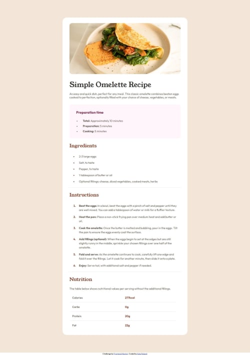
I think I did pretty well with this one. I feel like I'm getting better at responsive design, and imitating the design itself doesn't take me as long as it used to.
What challenges did you encounter, and how did you overcome them?I initially tried to do the nutrition section as a table, but I couldn't figure out how to imitate the lines between each value while using a table format. So instead I switched them into a flexbox and used a divider div to imitate that. I'm not sure if that was what the challenge was expecting though.
What specific areas of your project would you like help with?Is there a way to insert a divider between different rows of a table? When I tried, it would only set the divider before the table, rather than "inside" it.
Please log in to post a comment
Log in with GitHubCommunity feedback
No feedback yet. Be the first to give feedback on Kate's solution.
Join our Discord community
Join thousands of Frontend Mentor community members taking the challenges, sharing resources, helping each other, and chatting about all things front-end!
Join our Discord