Design comparison
Community feedback
- P@galonaranjoPosted 5 months ago
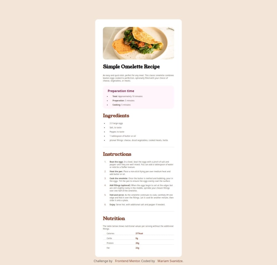
The design and details of the content are pretty spot on, Mariam. Not sure if this was by design, but it looks like the entire card might be set to fit the viewport on desktop, shrinking all the content to fit into it.
Also, some small details might need to be made to the image as the responsive design changes. This was a bit tricky for me, but changing the container's padding on mobile view so that there is no padding around the image.
But overall it looks great!
Marked as helpful0
Please log in to post a comment
Log in with GitHubJoin our Discord community
Join thousands of Frontend Mentor community members taking the challenges, sharing resources, helping each other, and chatting about all things front-end!
Join our Discord
