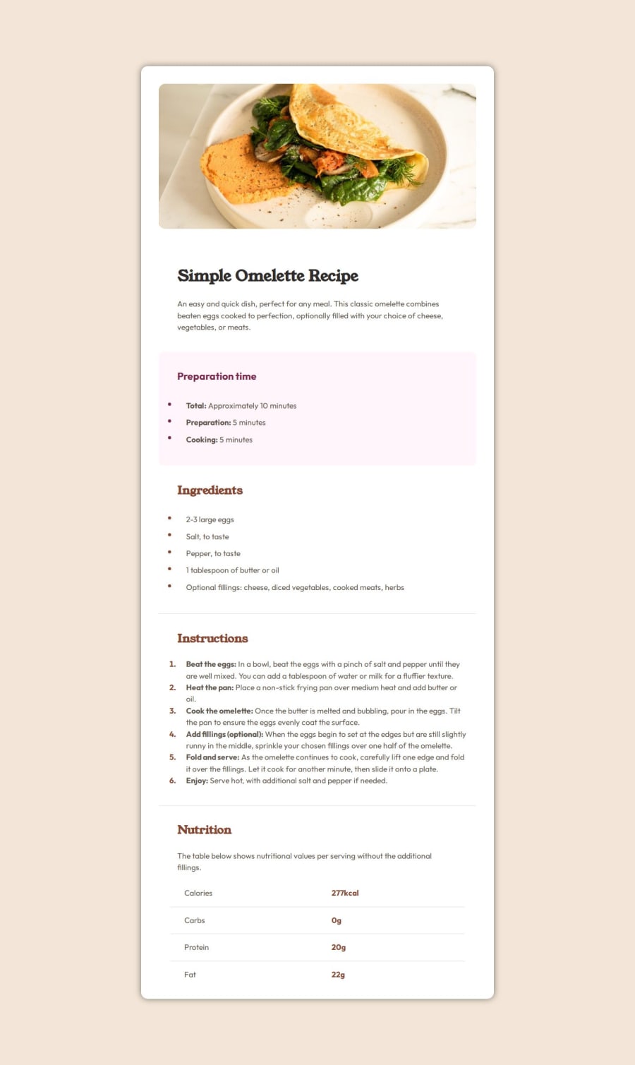
Design comparison
SolutionDesign
Solution retrospective
What challenges did you encounter, and how did you overcome them?
Spacing the markers in the lists. Used the tag span and then set the left position for the gap. Could've done better i think.
Community feedback
Please log in to post a comment
Log in with GitHubJoin our Discord community
Join thousands of Frontend Mentor community members taking the challenges, sharing resources, helping each other, and chatting about all things front-end!
Join our Discord
