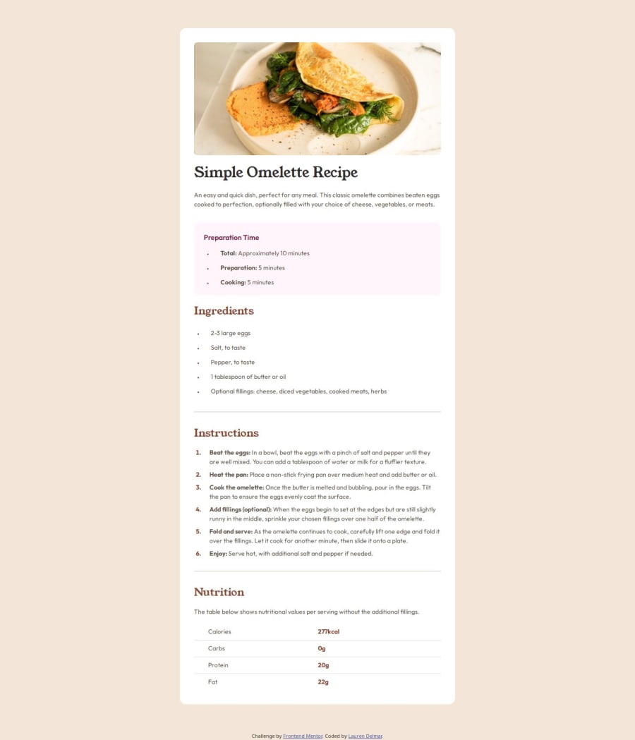
Design comparison
Solution retrospective
I am really pleased with the responsiveness of the page, works on small and large screens. I chose to use display: grid and gap to add white-space between the elements.
I had issues with the lists, aligning the bullets and also the wrapping text. I used list-style-position: inside; and text-indent: -2.2em; for those. To get the bullets and text different colours I wrapped the text in a ``. And with the table after some research I was able to align it correctly and add the lines between the rows
table {
  border-collapse: collapse;
  table-layout: fixed;
  width: 100%;
}

tr {
  border-bottom: 1px solid hsl(30, 18%, 87%);
}

tr:last-child {
  border-bottom: none;
}
How would you get the lists to align and the text so it doesn't wrap immediately underneath the bullet point?
Join our Discord community
Join thousands of Frontend Mentor community members taking the challenges, sharing resources, helping each other, and chatting about all things front-end!
Join our Discord
