Design comparison
SolutionDesign
Please log in to post a comment
Log in with GitHubCommunity feedback
- @razanabbas
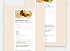
The design is good overall but I have a few comments:
- The source document was not very satisfying to read. I think you could've done it with less divisions.
- I suggest you add some left padding for list items inside unordered lists.
- I also suggest you add some spacing between table rows.
- Your card is a bit wider than it should be. Try applying a max-width. That's all I personally have to say. I hope you benefit from my feedback.
Join our Discord community
Join thousands of Frontend Mentor community members taking the challenges, sharing resources, helping each other, and chatting about all things front-end!
Join our Discord
