Design comparison
Solution retrospective
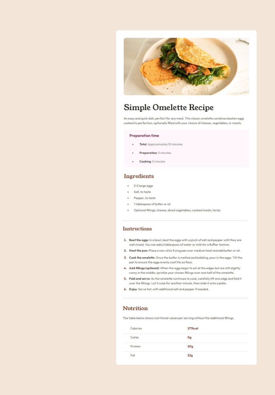
I'm most proud of my ability to make this site responsive. I made a mistake and completed the Desktop version first and then had to go back and do the Mobile version. Next time I will certainly code "mobile first."
What challenges did you encounter, and how did you overcome them?One of my biggest challenges with this project came from hosting it on GitHub Pages. The file path which works in VS Code does not work for publishing to GitHub Pages. I overcame this issue by researching online and quite a bit of trial and error. It was a good learning experience.
What specific areas of your project would you like help with?Because I struggled with making the site responsive I would appreciate anyone's feedback around my use of Semantic HTML Tags, Flexbox, and the way I wrote the CSS code to be responsive. Specifically:
- Do my HTML tags and structure meet what is generally accepted as best practice?
- Does my use of FlexBox meet generally accepted best practice? If not, how could I improve it?
- Does my responsive CSS (media queries) look properly structured? If not, how could I improve it?
Please log in to post a comment
Log in with GitHubCommunity feedback
No feedback yet. Be the first to give feedback on Todd Moussallem's solution.
Join our Discord community
Join thousands of Frontend Mentor community members taking the challenges, sharing resources, helping each other, and chatting about all things front-end!
Join our Discord
