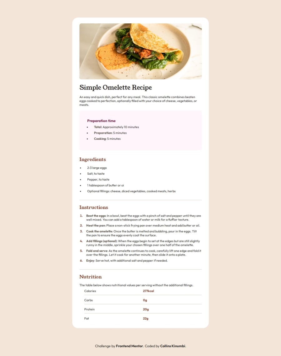
Design comparison
Solution retrospective
I'm glad I was able to think for myself. This was diffferent, it wasn't like following a tutorial. You actually had to think for yourself and know how to style it and make it look as identical to the original as possible. This showed me that I have learned and I do know what I'm doing.
What challenges did you encounter, and how did you overcome them?I couldn't make the site responsive at first. I started with the desktop design and planned to make the phone design after. So I left it alone for a while then when I learned responsive design in depth I realised a used 'width' instead of 'max-width' and just like that my problem was fixed and I finished the project.
Community feedback
Please log in to post a comment
Log in with GitHubJoin our Discord community
Join thousands of Frontend Mentor community members taking the challenges, sharing resources, helping each other, and chatting about all things front-end!
Join our Discord
