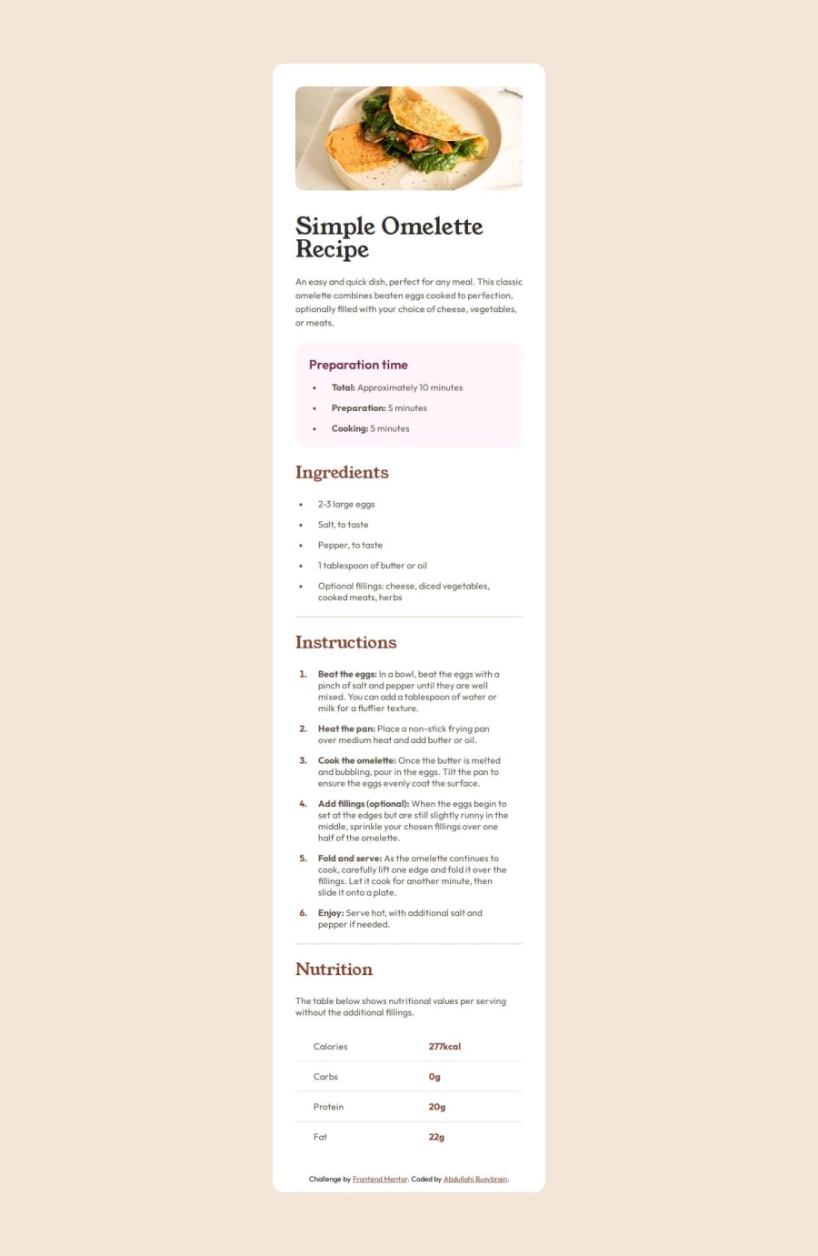
Design comparison
Solution retrospective
The more I do the more I know I don't know
What challenges did you encounter, and how did you overcome them?Styling Tables
What specific areas of your project would you like help with?Table, Media Query, Typography
Community feedback
- @fayiz770Posted 10 months ago
Congratulations on completing this challenge.
Your HTML and CSS code is quite well-structured, especially considering you're a beginner! Here are some detailed feedback points and suggestions for
improvement
HTML
DOCTYPE Declaration:
Perfect use of
<!DOCTYPE html>to declare the document type.Head Section:
The meta charset and meta viewport tags are correctly included. You included the favicon link, which is great for branding. Font links are repeated. You can combine them to optimize the loading time:
<link rel="preconnect" href="https://fonts.googleapis.com" /> <link rel="preconnect" href="https://fonts.gstatic.com" crossorigin /> <link href="https://fonts.googleapis.com/css2?family=Inter:wght@100..900&family=Outfit:wght@100..900&family=Young+Serif&display=swap" rel="stylesheet" />``` Body Content: Your main structure is clear and semantic. Using main, article, header, section, and footer tags correctly. The use of headings (h1, h2) and lists (ul, ol) is appropriate. Consider using more descriptive alt attributes for images to improve accessibility: `<img src="assets/images/image-omelette.jpeg" alt="A delicious omelette" />` Footer Attribution: It's clear and links are correctly implemented. CSS Root Variables: Good use of CSS variables for colors and fonts. This makes your design easily adjustable. Global Styles: Proper use of universal selector * to reset margin and set box-sizing. You might want to uncomment the padding: 0; line in your universal selector for a complete reset:- { margin: 0; padding: 0; box-sizing: border-box; }``` Body Styling:
The body styles are well-defined, setting up a flex container to center the content. Typography and Spacing:
Consistent use of padding and margin, ensuring a clean layout. Good use of transition for smooth animations. Responsive Design:
Media queries are correctly used to adjust styles for larger screens. Ensure all responsive elements are covered. For example, increase padding for other sections in larger viewports as well. Readability:
Your CSS is well-commented and organized, which improves readability and maintainability. Suggestions for Improvement Combining Font Links:
As mentioned earlier, combining the Google Font links helps in reducing the number of HTTP requests, improving performance.
Semantic HTML:
Consider using nav for navigation elements if you plan to add any. Use figure and figcaption for images with captions to provide more context. Accessibility:
Use ARIA roles and landmarks to enhance accessibility. For example:
<main role="main">
  ...
</main>
Ensure all images have descriptive alt text. Performance:
Minimize the use of large images or optimize them for web use. Consider adding a fallback font for when custom fonts fail to load:
body {
  font-family: var(--main-font), Arial, sans-serif;
}
Overall
Your code is well-done and demonstrates a solid understanding of HTML and CSS fundamentals. With a few optimizations and enhancements for performance and accessibility, it will be even better. Keep experimenting and learning—you're on the right track!
If you find this helpful, please mark it as useful.
Marked as helpful1 - @abdul-busybrainPosted 10 months ago
I checked your review I will try as much as possible to consider all your observations
0
Please log in to post a comment
Log in with GitHubJoin our Discord community
Join thousands of Frontend Mentor community members taking the challenges, sharing resources, helping each other, and chatting about all things front-end!
Join our Discord
