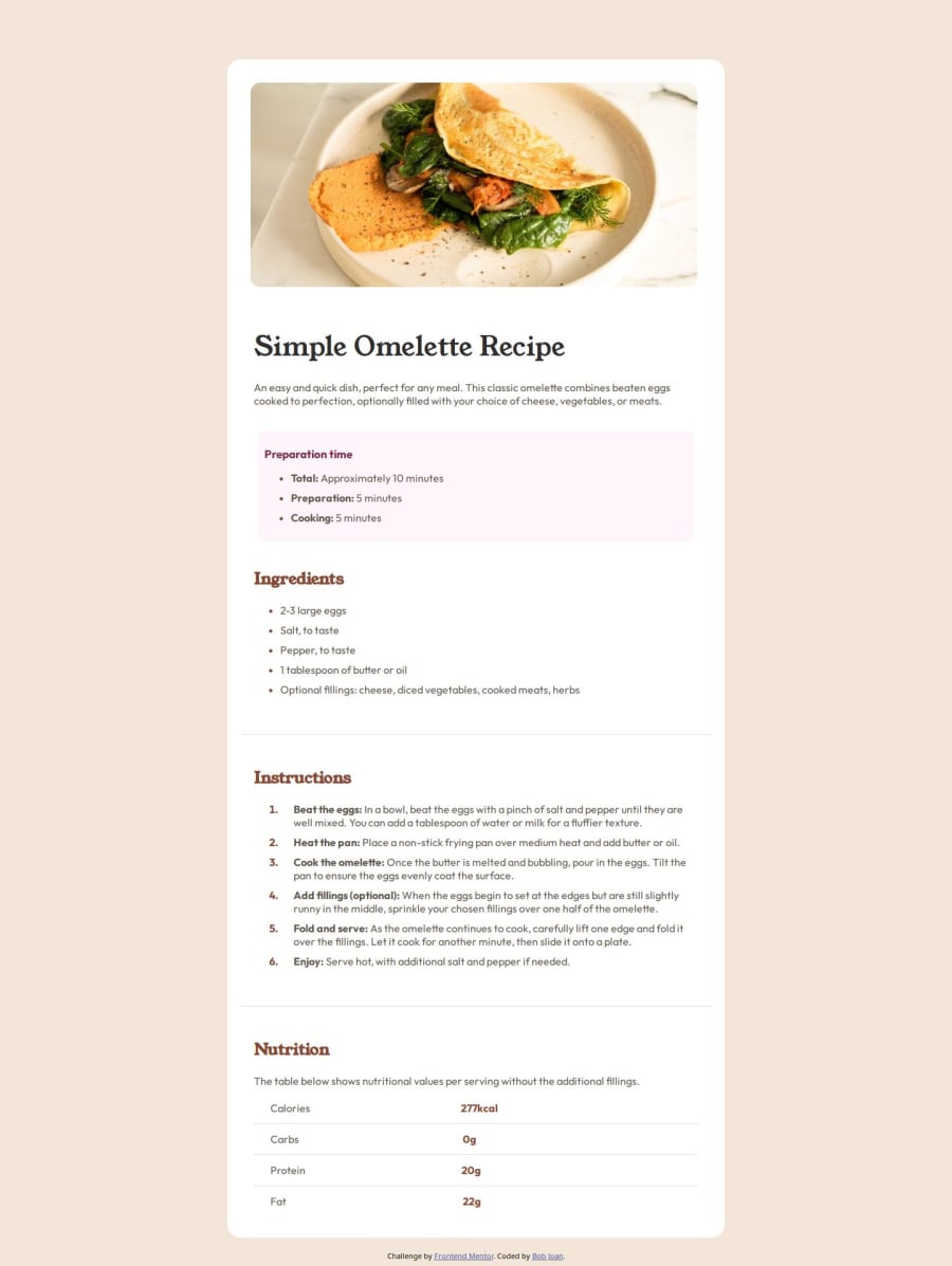


Design comparison

Solution retrospective
Found it difficult getting the h1 to display like the mobile sample . Suggestions are welcome on the entire project
Community feedback
- @solvmanPosted 10 months ago
Hi @bobjoan 👋
Very well done 🤩 Congratulations 🎉
Your use of
htags is excellent 👍. Remember to use landmark elements to structure your HTML document. Landmarks are sections of a page that can be identified by assistive technologies, allowing users to understand the page's structure and navigate it more easily. They are typically defined using certain HTML5 sectioning elements or ARIA roles. Using more semantic HTML instead of plain <div> (non-semantic) elements is better for better accessibility. Consider replacing <div> elements with <section> semantic elements to divide your HTML document logically. I am afraid your use of the<article>element as a sectioning container is incorrect. The<article>element represents a complete and self-contained piece of reusable content, such as a newspaper article, forum post, blog post, or recipe. 👌You may use the <article> element to wrap the card. Consider wrapping everything with the <main> element. For example:<body> <main> <article class="main-container"> <img .../> <h1>Simple Omelette Recipe<h1> <p>...</p> <section> <h2>Ingredients</h2> ... </section> <section> <h2>Instructions</h2> ... </section> <section> <h2>Nutrition</h2> ... </section> </article> </main> </body>You may read more about it in:
⭐️ HTML - Living Standard - Sections
⭐️HTML - Living Standard - Sectioning content
A few other things to mention:
- ⭐️ Great use of global variables 🫶
- ⭐️ Consider using REM units for font size, padding, and margin.
- ⭐️ You have a lot of repetitive code. You set the same padding repeatedly on different elements. Consider setting padding once on a parent container instead.
- ⭐️ Refrain from setting container sizes, even if you use percentage points. It is better to use min/max-width. Remember, by default, HTML is pretty responsive if you do not stand in its way with hard-set values. Setting your heading size to 70% on mobile and 90% on desktop with an additional margin makes it look squeezed together. Setting your
.containertowidth: 50%also causes your content to get squeezed on smaller widths. Consider re-doing your container as so:
.container{
    background-color: white;
}

@media (min-width: 700px) {
  .container{
    max-width: 736px;
    margin: 7rem auto; /* 7rem on top and bottom, auto on left and right */
    border-radius: 1.5rem;
    padding: 2.5rem;
  }
}
In the above example, I use the Mobile Layout First approach, letting the container be as wide as it wants. As soon as it reaches 736px wide, it stops growing and is placed horizontally in the middle of the screen (because of margin auto) with a 7rem margin on top and bottom. I want to point out how I also applied padding to the container, so all your inner elements will no longer have to be padded on the left and right sides.
I highly recommend checking out the newly published article "A practical guide to responsive web design"
Otherwise, very well done! 🚀 Impressive! 🎉 Keep it up! 👍
Marked as helpful0

Please log in to post a comment
Log in with GitHub
Join our Discord community
Join thousands of Frontend Mentor community members taking the challenges, sharing resources, helping each other, and chatting about all things front-end!
Join our Discord